Most emails don't fail because of the offer. They fail in the last inch, the button nobody was quite sure whether to click.
You spent hours on the subject line and the body copy, and then the whole thing hangs on two or three words at the bottom that you wrote in about four seconds.
That's backwards. In email marketing, the call to action is the only part of the message whose entire job is to get someone to do something, and it usually gets the least attention of anything on the page.
Why the button carries more weight than the copy above it
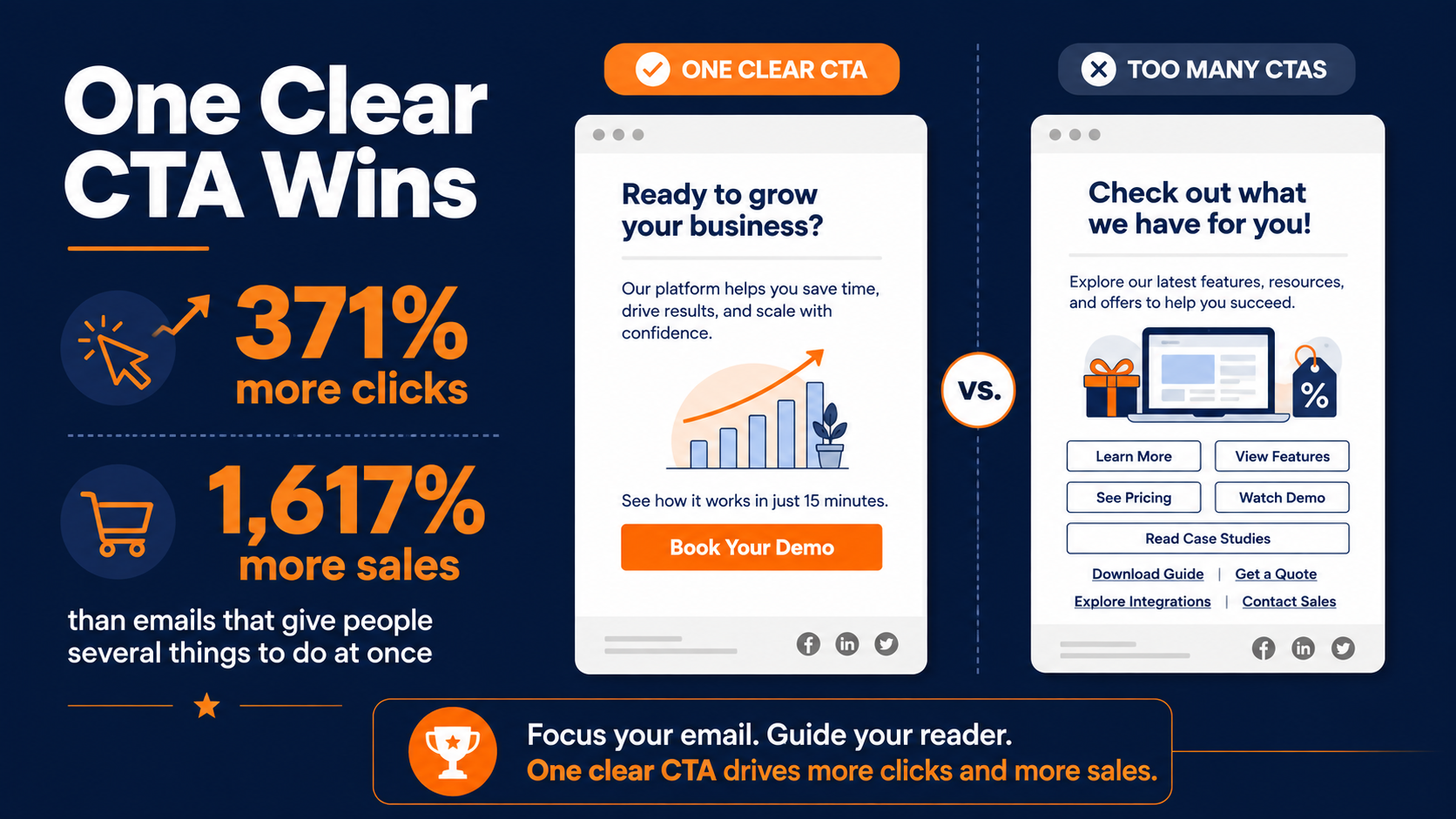
Emails built around a single, clear CTA see 371% more clicks and 1,617% more sales than emails that give people several things to do at once. Those numbers sound too big to be real, but the mechanism behind them is boring and true.
Every extra choice you add is a small tax on the reader's attention, and enough of those taxes and they close the email instead of clicking anything.
That single-choice advantage has held up across platforms and years, not just one study. Recent large-scale analysis of billions of sends found the same gap widening rather than shrinking, with the effect strongest among younger readers who bail fastest on a cluttered layout.
So the goal for the rest of this piece is simple. One action per email, and a call to action good enough to earn the click on its own. Everything below is in service of those two things.
Get the Wording Right Before Anything Else
The words come first, before color, before size, before placement. A beautiful button pointing at a vague ask still gets ignored. Get the language doing real work, then worry about the design wrapped around it.
Most calls to action land somewhere between two and five words. That's not a rule so much as a reflection of how people actually read a CTA button, which is to say barely. They register the shape, catch the verb, and decide. If your CTA needs a full sentence to make sense, the problem is usually upstream in the body copy, not in the button itself.
Keep in mind the button doesn't work alone. It's the payoff for everything the email already said. The body carries the argument. The button just gives the reader somewhere to put the "yes" you've already earned. When people try to cram the whole pitch into the button, it reads desperate, and desperate doesn't convert.
Lead with a verb and make it about them
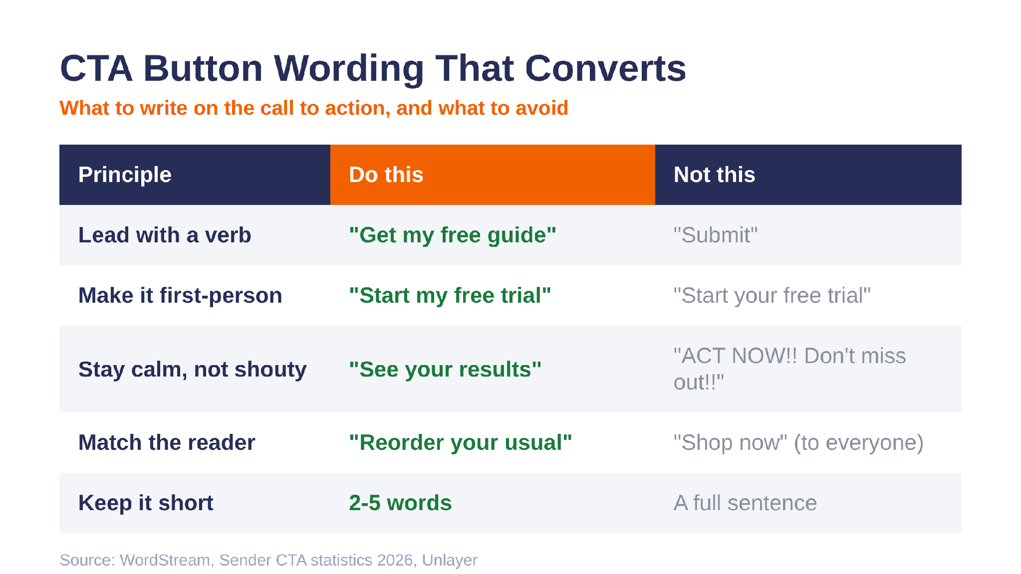
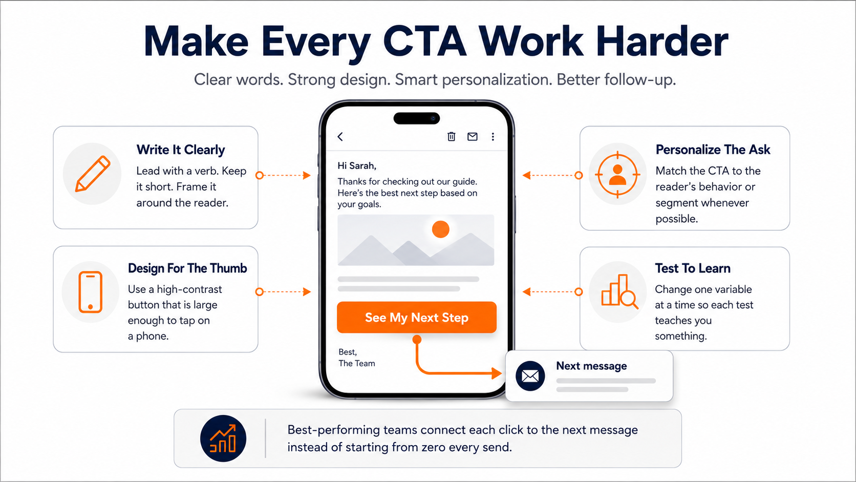
Start the CTA with an action word and frame it around what the reader gets, not what you want from them. "Get my free guide" beats "Submit" every time, partly because "submit" describes work and "get" describes a reward. There's a well-known test where changing a button from "Start your free trial" to "Start my free trial" lifted clicks by 90%. Same offer, same button, one pronoun.
First-person phrasing quietly reframes the click as something the reader is doing for themselves rather than something they're doing for you.
That's the whole trick with wording. You're not describing a transaction, you're describing the thing on the other side of the click. Write the button as the reader's next move, not your ask.
Pro Tip: Read your CTA out loud starting with "I want to." If "I want to submit" sounds worse than "I want to get my guide," your button already told you which verb to use.
Watch out for wording that unknowingly backfires
There's a wrinkle worth knowing. Command-style, hyper-promotional wording in red is powerful. It beats green in most tests because it contrasts hard against the rest of the layout. Contrast is the actual lever, not the hue.
Pick a color used sparingly, or not at all, elsewhere in the email so the button pops off the page. Make sure the text inside the button reads cleanly against it, no pink text on a red button. And pulling a color from your logo is a safe default, since it's already on-brand and rarely competes with your body text.
A quick reference for CTA button wording
If it helps to see the wording principles side by side, here's the short version of what tends to convert and what tends to fall flat.
Put the Call to Action Where Attention Actually Goes
Placement gets treated like a religious debate. Above the fold or below? At the top where nobody scrolls past it, or at the end as the natural close?
Here's the honest answer. Placement matters, but not as a fixed rule you can lift from someone else's email. It depends on how long your email is, what you're asking for, and how much convincing the ask needs before someone's ready to act.
Match the position to the size of the ask
A quick, low-stakes ask like "read the post" or "grab the freebie" can sit high, because the reader doesn't need much persuading to take it. A bigger ask like "book a demo" or "start a paid trial" usually earns its spot after you've made the case, near the end, where the reader has the context to say yes.
The mistake isn't top versus bottom. It's putting a heavy ask up top before you've given anyone a reason to take it. Ask for the wedding on the first date, and you get nothing. The position should track the trust you've built by that point in the email.
Repeat the same call to action, don't add new ones
In a longer email it's fine to place the same call to action more than once, once near the top and again at the close, so a reader who's convinced early doesn't have to scroll back to find it.
That's one CTA repeated, which is a very different thing from stacking several competing asks. One goal, offered at two moments, keeps the focus. Two goals split it and you're back to the attention tax from the opening.
Align every button around a single, specific instruction
The line to watch is intent. Two buttons serving the same reader at the same moment is one CTA shown twice. Two buttons pulling the reader toward different outcomes is the mistake that tanks your clicks.
If you want to go deeper on what to actually write on each button, we broke down making every button a specific instruction in our advanced copywriting guide. can actually work against you by triggering a little flicker of resistance, the same way a pushy salesperson makes you want to leave the store.
Tone down the sales pitch to boost button clicks
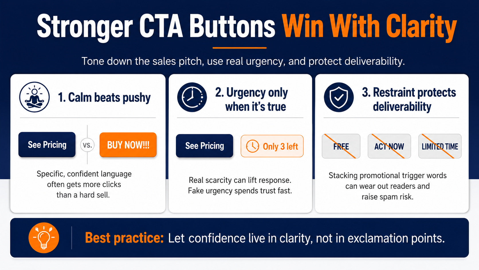
Often a plain, generic button ends up outperforming a louder promotional one. That's counterintuitive until you remember the reader's guard goes up the second something feels like it's being sold too hard.
It doesn't mean strip all personality out. It means the confidence should live in the clarity, not in the exclamation points. A calm, specific button often beats a shouty one because it respects the reader's intelligence instead of poking at it.
Use urgency, but only when it's true
Urgency works because people move faster when they think they might miss out. A phrase like "only 3 left" placed near the button taps straight into that, and we've watched it reliably lift response whenever a real constraint sits behind it. The pull is plain loss aversion, one of the oldest levers in the book, and it still works.
The catch is that fake urgency is worse than none. If your "limited time" offer runs every single week, people notice, and the next time you actually mean it, nobody moves. You've spent the credibility. Save the countdown language for the moments it's real, and it keeps its power.
Stop risking spam folders for low-converting hype
There's also a deliverability angle most people forget. Stacking promotional trigger words like "free," "act now," and "limited time" doesn't just wear out the reader, it raises your spam risk, which means the button never gets seen at all. Restraint here protects both the click and the inbox placement.
Design the Button So It Can't Be Missed
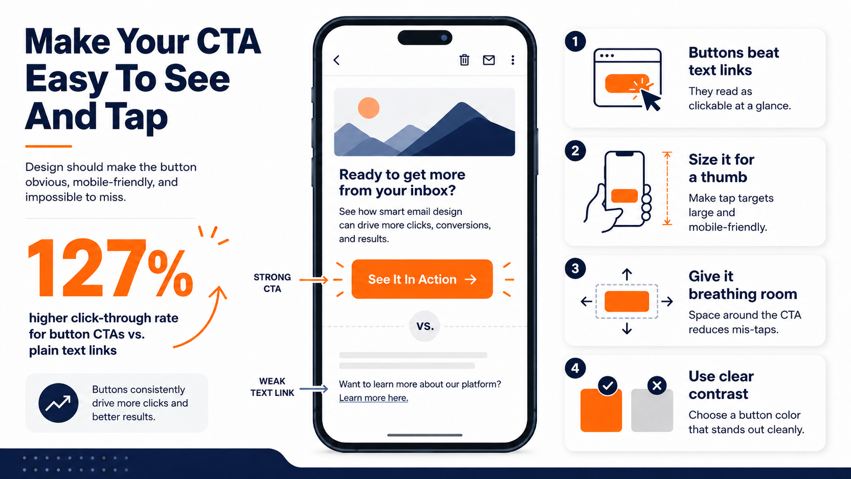
Once the words are working, the design's only job is to make sure the CTA button gets seen and gets tapped. In most emails, a button beats a text link outright. Button-based CTAs improved click-through rates by 127% over plain hyperlinked text, because a button reads as clickable at a glance and a link buried in a paragraph doesn't.
The reason is simple. A CTA button is a signal. It says "this is the thing to press" without the reader having to hunt for it. A hyperlink buried in email marketing copy asks them to notice, hover, and trust that it goes somewhere useful. Every one of those micro-steps sheds a few readers.
Size it for a thumb, not a mouse
Well over half of all opens now happen on a phone, which means your button is being tapped, not clicked. That changes the math on size. A button that looks generous on a desktop preview can be a frustrating little target on a phone, and a frustrated reader is a reader who gives up before the tap lands.
Most email templates from a decent provider handle this with responsive design, scaling the button to the screen. Oversized buttons consistently out-earn cramped ones on mobile, and the floor is simply "big enough to hit with a thumb without zooming in."
Give the button breathing room too. A tap target crammed against other links invites the accidental miss-tap that sends someone to the wrong place, and a reader who lands somewhere they didn't intend rarely tries again.
Pick a color that fights with nothing around it
There's no magic converting color, so stop looking for one. Red doesn't beat green because red is powerful. It beats green in most tests because it contrasts hard against the rest of the layout. Contrast is the actual lever, not the hue.
Pick a color used sparingly, or not at all, elsewhere in the email so the button pops off the page. Make sure the text inside the button reads cleanly against it, no pink text on a red button. And pulling a color from your logo is a safe default, since it's already on-brand and rarely competes with your body text.
Understanding CTA placement by conversion rate
Placement affects conversion enough that it's worth seeing the spread laid out. Different positions pull very different numbers, which is a useful gut-check the next time someone on your team insists there's only one right spot for the button.
|
CTA Placement |
Typical Conversion Rate |
|---|---|
|
Inline (within the content) |
Higher-performing baseline |
|
End-of-content CTAs |
0.3% - 0.9% |
|
Sidebar CTAs |
0.4% - 1.8% |
|
Pop-ups |
3.7% - 13.6% |
|
Welcome gates |
10% - 25% |
The takeaway isn't to chase the highest number in the table and slap a welcome gate on everything. It's that placement is a variable you get to control, so treat it like one and test it against your own list rather than trusting a blanket rule you read somewhere.
Personalize the Ask, Not Just the Greeting
Email personalization usually stops at the subject line, maybe a first name up top, and then the button says the same thing to everybody. That's the miss. The call to action is where personalization actually pays off.
A CTA that reflects what the reader has already done, or where they are in their journey, routinely outperforms a generic one aimed at the whole list by a wide margin, because it reads as written for that person instead of for everyone at once.
Why a relevant button beats a clever one
A returning customer and a first-time subscriber shouldn't see the same button, because they're not deciding the same thing. "Reorder your usual" makes sense for one and sounds like gibberish to the other. When the ask matches the reader's actual situation, the click stops being a leap and starts being an obvious next step.
You don't need a complex setup to start seeing this. Even splitting one email into a "new subscriber" version and an "existing customer" version, each with its own tailored CTA, moves the needle more than another round of button-color testing.
Relevance beats polish. A plain button pointed at the right thing outperforms a gorgeous one pointed at the wrong thing every time.
Let behavior pick the button
The next level up is letting what someone did choose their CTA for them. Someone who watched most of your product video is ready for a different ask than someone who skimmed a newsletter. A reader who's gone quiet for two months needs a re-engagement nudge, not a "buy now." When the button reacts to real behavior, it lands as timely instead of generic.
This is also where personalization stops being a copywriting exercise and becomes an email marketing systems question. You can hand-write a clever button. You can't hand-sort ten thousand readers by what they last clicked, at least not more than once before you burn out.
Test one thing at a time or learn nothing
Personalization is a testing question at heart, and testing only works if you change one variable per test. Swap the CTA wording, or the color, or the placement, but not all three at once, or you'll get a result with no idea what caused it.
We've broken down the wider habit of measuring one change at a time in our guide to steps that actually optimize email performance, and the same discipline applies to the button in miniature.
That discipline is the difference between "we think the new button worked" and "we know the new button worked, and here's by how much." Only one of those tells you what to do on the next send.
Pro Tip: Log every CTA test in one place with the single variable you changed. Six months of that beats any best-practices list, because it's your list telling you what your readers do.
Turn One-Off Buttons Into a Connected Journey
Here's the part that gets lost in all the button-tweaking. The best CTA in the world still only points at one moment. What actually compounds over time is when the click a reader makes today shapes the email they get tomorrow.
Most teams treat every send as a standalone event. Write a good CTA, hit send, start over next week. The reader who clicked "book a demo" and the reader who ignored it both get funneled into the same next email, which means the signal they just handed you gets thrown straight in the trash.
Catch behavioral intent to deliver the right follow-up message
That signal is the most valuable thing in the whole exchange, and it's the piece a single well-written button can't capture on its own. A great CTA earns the click. What you do with that click is a different job, and it's the one that separates a good email from a program that keeps working.
That's where we come in. With Pinpointe's marketing automation tools, you can catch exactly that signal, so a click on today's call to action decides what lands in the inbox next, without you rebuilding the routing by hand every time. The button stops being the end of the interaction and becomes the thing that quietly sorts your list into who's ready and who needs another beat.
What to Fix on Your Next Send
The call to action does more work than almost anything else in your email, so it's worth treating like the closer it is. Start with the wording, lead with a verb, frame it around the reader, and keep it to a handful of words. Watch the shouty promotional language that makes readers pull back, and use urgency only when it's real.
Wrap the words in a button with enough contrast and size that it can't be missed on a phone. Place it to match the weight of the ask, and if you repeat it, repeat the same one rather than piling on new asks.
Then personalize it to who's reading, let behavior pick the button where you can, and test a single variable at a time so you actually learn something instead of guessing.
See where your current calls to action are leaking clicks
The teams that pull ahead in email marketing aren't the ones with the cleverest button copy. They're the ones who connect each click to the next message instead of starting from zero every send.
If you want to see where your current calls to action are leaking clicks, request a demo, and we'll walk through your actual sends with you and show you what a connected journey would catch that a one-off button lets slip.