If you've been doing any marketing for your company, your website likely already gets visitors. But most of them leave without doing a single thing and defeat the purpose you built the site for to begin with.
That missing bridge between the traffic you already paid for and the tiny slice that converts is the most expensive problem most marketers struggle to fix.
Why buying more clicks won't fix your revenue problem
It's easier to buy more clicks than to figure out why the clicks you have aren't turning into subscribers, leads, or customers. So that's what most teams do. They pour money into the top of the funnel, and just accept a leaky middle.
Website conversion optimization flips that math. Instead of chasing more visitors, you get more out of the ones already showing up. Same traffic, more revenue. That's the whole game.
What "conversion" really means before you optimize for it
A conversion is any specific action you want a visitor to take. Not "engagement." Not "time on page." A concrete, countable action tied to your business.
For most sites, that action falls into one of three buckets. A visitor becomes a subscriber on your email list, a lead who fills out a form, or a customer who buys. You can chase softer goals like a social follow or a blog subscription, but those three are the ones you can actually measure against revenue, so you should start there.
Everything that follows is a way to move more of your existing visitors into one of those three buckets. None of it requires a single extra click of paid traffic. This is the heart of conversion rate optimization, the practice of raising the percentage of visitors who act rather than the number of visitors who show up.
Decide What You Want a Visitor to Do Before Anything Else
You can't optimize a page for conversions until you've decided what converting even means on that page. This sounds obvious, but It's the step most teams skip and end up focusing all their time on redesigning a button color in hopes that will maximize conversions.
Every page has a job. A blog post's job might be capturing an email. A product page's job is starting a purchase. A pricing page's job is booking a demo. When a single page tries to do all three, it does none of them well, and the visitor leaves with the decision made for them by default, which is to do nothing.
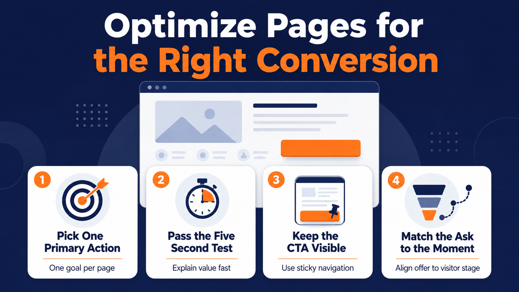
Pick one primary action per page
Give every important page a single primary conversion goal, then design everything on that page to serve it. Secondary actions can exist, but they should never compete for attention with the main one.
If your blog post wants an email subscription, the email capture should be the loudest offer on the page. Bury it under a "contact sales" button, a newsletter popup, and three related-post widgets, and you've split the visitor's attention four ways. Attention doesn't divide well. It just evaporates.
Pass the five-second test above the fold
Here's a fast way to check whether your page is doing its job. Show it to someone for five seconds, take it away, and ask what the site does and what they're supposed to do next. If they can't answer both, your value proposition isn't landing fast enough.
The area above the fold, the part of the page a visitor sees before scrolling, has to communicate your value proposition instantly. Not your company history. Not a clever tagline that needs a second read. A plain statement of what you do and who it's for, with the primary action sitting right next to it.
Most visitors decide whether to stay or leave in that first screen. If they have to scroll and hunt to understand why they should care, most of them won't bother. They'll be gone before your best argument ever loads.
Keep the CTA in view with sticky navigation
A call to action only works if the visitor can act on it the moment they're convinced. On a long page, the button that lived at the top is useless to someone who got sold three screens down and now has to scroll back up to find it.
Sticky navigation solves this by keeping your primary CTA visible as the visitor scrolls, pinned to the top or edge of the screen the whole way down.
The offer stays one click away no matter how far they read. When conviction hits, the button is right there, instead of a scroll away and a moment of friction that talks them back out of it.
Map the goal to where the visitor is in their buyer's journey
Someone reading an introductory blog post isn't ready to buy. Asking them to "request a demo" is asking for a commitment they haven't warmed up to yet. The mismatch kills the conversion before the copy gets a chance.
Match the ask to the moment. Early-stage visitors convert on low-friction offers like a guide or a subscription. Late-stage visitors, the ones on your pricing page, are ready for a demo or a trial. The right offer in the wrong spot performs worse than a mediocre offer in the right one.
Make Your Call to Action Impossible to Ignore or Misread
People need to be told what to do next. Assuming a visitor will figure out the path from your content to your form on their own is how good pages underperform. The call to action carries more conversion weight than almost anything else on the page, and it's usually the most neglected element.
A strong CTA does two things. It tells the visitor exactly what happens when they click, and it makes clicking feel like the obvious next move rather than a risk. Vague buttons like "Submit" or "Learn More" do neither.
Write the button copy around the value, not the action
"Submit" describes what the visitor does for you. "Get my free audit" describes what the visitor gets. That difference is small on the page and large in the results.
Specific, value-oriented button copy consistently outperforms generic labels because it answers the question every visitor is silently asking, which is "what's in this for me." Tell them, right on the button, and you remove the last bit of hesitation before the click.
Personalize the CTA when you can
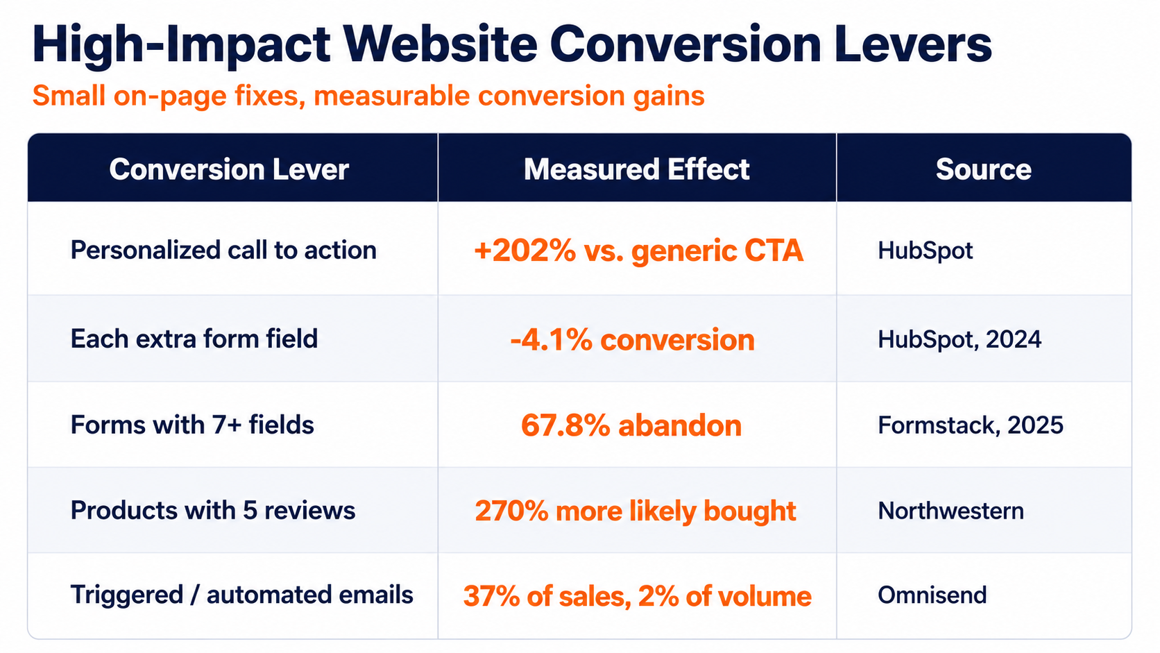
A CTA that adapts to who's looking at it beats a one-size-fits-all button by a wide margin. In one analysis of more than 330,000 calls to action over six months, personalized CTAs converted 202% better than static ones aimed at everyone. The same page and the same traffic, doing twice the work, off nothing but a smarter button.
We've watched this pattern hold up across years of campaigns. A returning visitor who already downloaded your guide shouldn't see the same "start here" offer as a first-timer. Show them the next step, not the first one, and the button starts converting like it knows who's reading it, because it does.
|
Pro Tip: Change your primary button copy from "Submit" to the specific thing the visitor receives, and measure the lift before you touch anything else on the page. |
Embed Your Best Offers Inside the Content People Already Read
Most teams treat lead capture like a destination. They build a standalone landing page for the guide or the checklist, then hope visitors leave the content they're actually reading to go find it. Most won't. Every extra click between interest and action is a place to lose people.
Stop hiding your lead magnets on separate pages
The way to fix this is with in-line value capture. Embed a clean opt-in form directly inside your highest-traffic content, right where the visitor is already paying attention, instead of routing them somewhere else to convert. If a blog post is pulling steady traffic and touches on a problem your lead magnet solves, the offer belongs in that post, not on a page the reader has to go hunting for.
The moment a visitor is nodding along with your content is the moment they're most willing to trade an email for more of it. Capture that moment where it happens. A lead capture form embedded in the flow of what someone's reading converts far better than the most beautiful landing page they never clicked through to.
This is one of the simplest ways to optimize your website for conversions without touching your traffic at all. The reader is already there. The interest is already warm. Putting a clean lead capture form in front of that interest, instead of a link to go find it, is often the single highest-return change on the page.
Strip Your Forms Down to What You Actually Need
Every field you add to a form is a small tax on conversion. The visitor weighs the effort of filling it out against how badly they want what's on the other side, and every extra box tips that calculation toward leaving.
The data here is unusually clean for marketing. Each additional form field drops the conversion rate by about 4.1% on average. Stack a few unnecessary fields together, and you've cut your conversions unknowingly by double digits before the visitor has even decided whether they want your offer.
Know the point where forms start falling apart
There's a threshold where a form stops being a reasonable ask and starts being a wall. Push past it, and you don't lose a few percent. You lose most of the people.
Every field beyond the essentials is a chance for someone to decide the trade isn't worth it, and once they've closed the tab, no amount of clever follow-up brings them back.
Ask for less now, learn the rest later
The instinct to collect everything upfront comes from a good place. It's also a common spot for a lack of marketing and sales alignment. Sales wants qualified leads, and more data feels like more qualification. But a long form that scares off the lead entirely qualifies no one.
Collect the minimum you need to start a relationship, usually just an email, sometimes a name. You can gather company size, role, and budget gradually as the person interacts with you over time. A lead you can profile slowly beats a perfect profile you never captured because the form was too long to finish.
Reduce friction everywhere, not just in the form
Form length is the friction people talk about most, but it's not the only place a page fights its visitor. Every point of confusion, hesitation, or unnecessary effort is friction, and friction is where conversions leak.
Look at your highest-value pages the way a first-time visitor would. Is the offer clear in the first few seconds? Is the next step obvious? Is anything asking the visitor to think harder than they should have to? Each of those small hesitations compounds, and the visitor rarely tells you they left because of them. They just leave.
Most of website conversion optimization is exactly this unglamorous. You find the small frictions, one page at a time, and you take them out. The dramatic wins get the case studies, but steady conversion rate optimization is a hundred small improvements that each recover a few percent of the people you were already losing.
Speed Is a Conversion Feature, Not a Technical Detail
A slow page converts worse than a fast one. This gets filed under "developer problem" and is often ignored by marketers, which is a mistake. Because page speed is one of the highest-leverage conversion levers you have, and it doesn't require rewriting a word of copy.
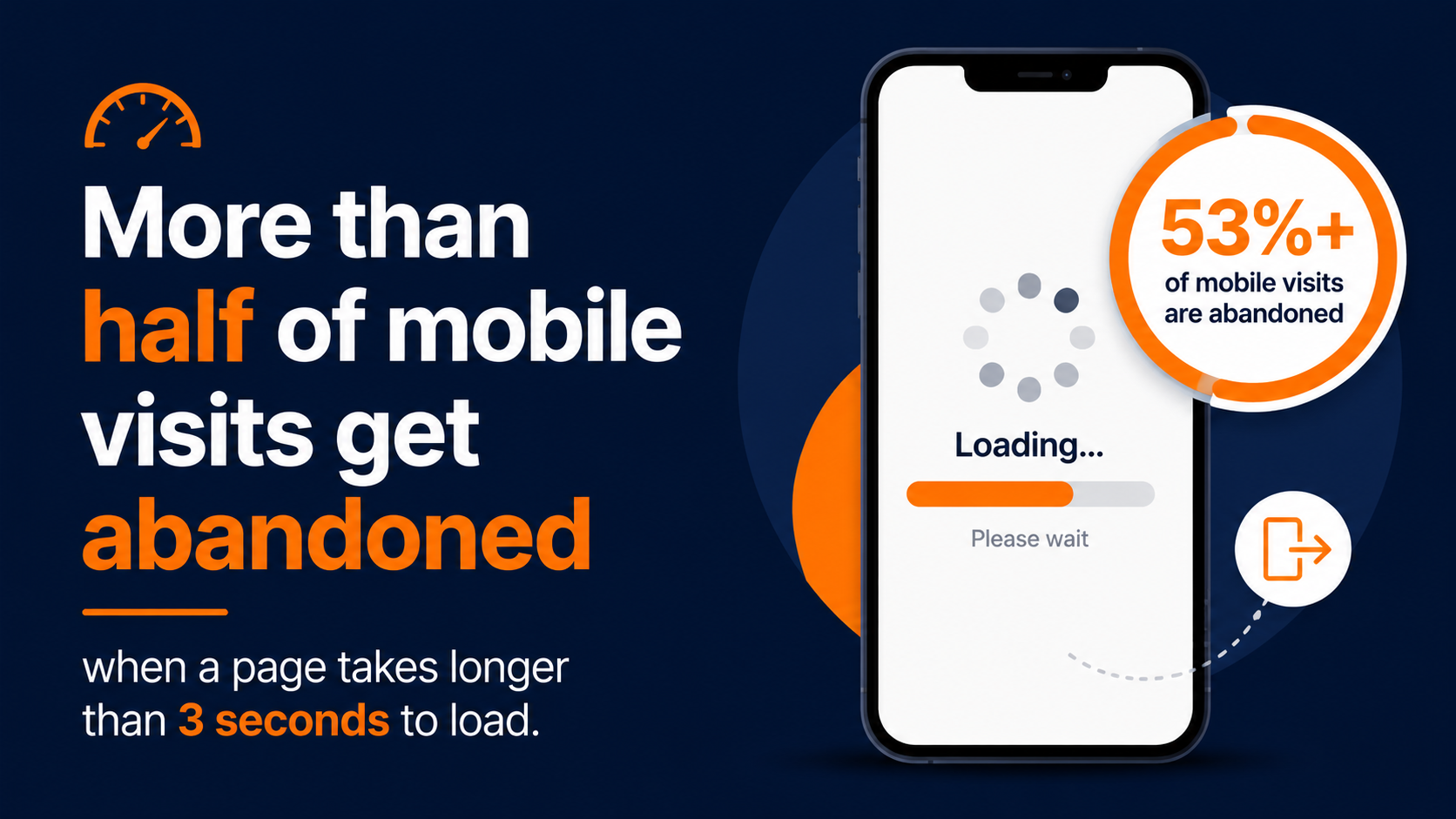
The visitor's patience is thinner than most teams assume. More than half of mobile visits get abandoned when a page takes longer than three seconds to load. Those aren't people who read your pitch and decided you weren't for them. They never saw your page at all. They left while your beautifully optimized headline was still loading.
Treat every second of load time as lost revenue
The relationship between speed and conversion is direct and unforgiving. Slower pages don't just annoy people. They measurably shrink the pool of visitors who ever get the chance to convert.
Most of the biggest speed gains are unglamorous. Compress your images. Cut the third-party scripts you stopped using two years ago. Get your hosting in order. None of these steps sound exciting, but all of them add up to convert better than the redesign someone keeps pushing for.
Design mobile-first, because that's where the traffic is
Mobile is not the secondary case you handle after the desktop version looks right. It's where most of your audience already lives. Mobile devices account for more than half of all global website traffic, which means a site that only feels good on a wide monitor is broken for most of the people using it.
Mobile-first fluidity means designing so the layout adapts to the screen instead of fighting it. Columns stack cleanly into a single readable flow on a narrow screen instead of squishing side by side. Typography scales so body text stays legible without pinching and zooming. Buttons stay big enough to tap with a thumb. The page should feel built for the phone, not shrunk down to fit it.
Test your key pages on an actual phone on a normal cellular connection, not on office wifi. The difference between how your site feels to you and how it feels to a real mobile visitor is usually where a surprising number of your conversions are disappearing.
Turn Site Speed Into Behavioral Intelligence
Speed does something else that most teams never connect to conversions. A page that loads fast enough gives your system time to recognize the visitor and stamp a cookie before they bounce, which is what makes everything downstream possible.
That cookie is the start of digital footprint tracking. Once a visitor is recognized, you can watch what they actually do. Which pages they read, which offers they click, how many times they come back. That behavioral data is the raw material for every smart thing you do next, and none of it gets collected if the page is too slow to load before they leave.
Let behavior update lead status in real time
Tracking behavior was never about building a dashboard nobody reads. The point is acting on what a visitor does the instant they do it. Someone who visits your pricing page three times in a week is telling you something a cold list never could.
Behavioral web triggers turn those signals into action automatically. A visitor crosses an engagement threshold and their lead status updates, moving them into a warmer sequence or flagging them for sales, without anyone manually watching the logs. The visitor's own behavior decides what happens next, in real time, while the intent is still fresh.
|
Pro Tip: Fix your slowest key pages first so the tracking cookie loads before visitors bounce, then wire behavioral triggers to the actions that signal real buying intent. |
Give Visitors a Reason to Trust You Before You Ask for Anything
Nobody converts on a page they don't trust. A visitor deciding whether to hand over an email or a credit card is running an internal risk assessment, and your job is to answer the objections they haven't said out loud. Social proof is how you do it.
Reviews, testimonials, recognizable logos, and specific results all do the same work. They tell a hesitant visitor that other people like them made this choice and didn't regret it. That reassurance often matters more than another paragraph of your own copy, because it's not coming from you.
Put proof where the decision happens
Social proof buried on a separate testimonials page does almost nothing. The visitor decides on the page with the form or the buy button, so that's where the proof needs to live, right next to the moment of hesitation.
The lift from reviews specifically is hard to overstate. Products with just five reviews are 270% more likely to be purchased than products with none. The reviews don't have to be glowing or numerous. They just have to exist, because their presence signals that other real people took the same step and came out fine.
Match the proof to the objection
Different conversions trigger different fears. A visitor about to buy worries the product won't deliver. A visitor about to book a demo worries they'll get trapped in a pushy sales call. Aim your proof at the specific worry.
If your demo signups are low, a testimonial about how helpful your sales conversation actually was will do more than a generic five-star quote. The best social proof rarely reads as the most flattering. What it does instead is answer the exact question keeping that visitor's finger off the button.
Turn a One-Time Conversion Into a Sequence That Keeps Working
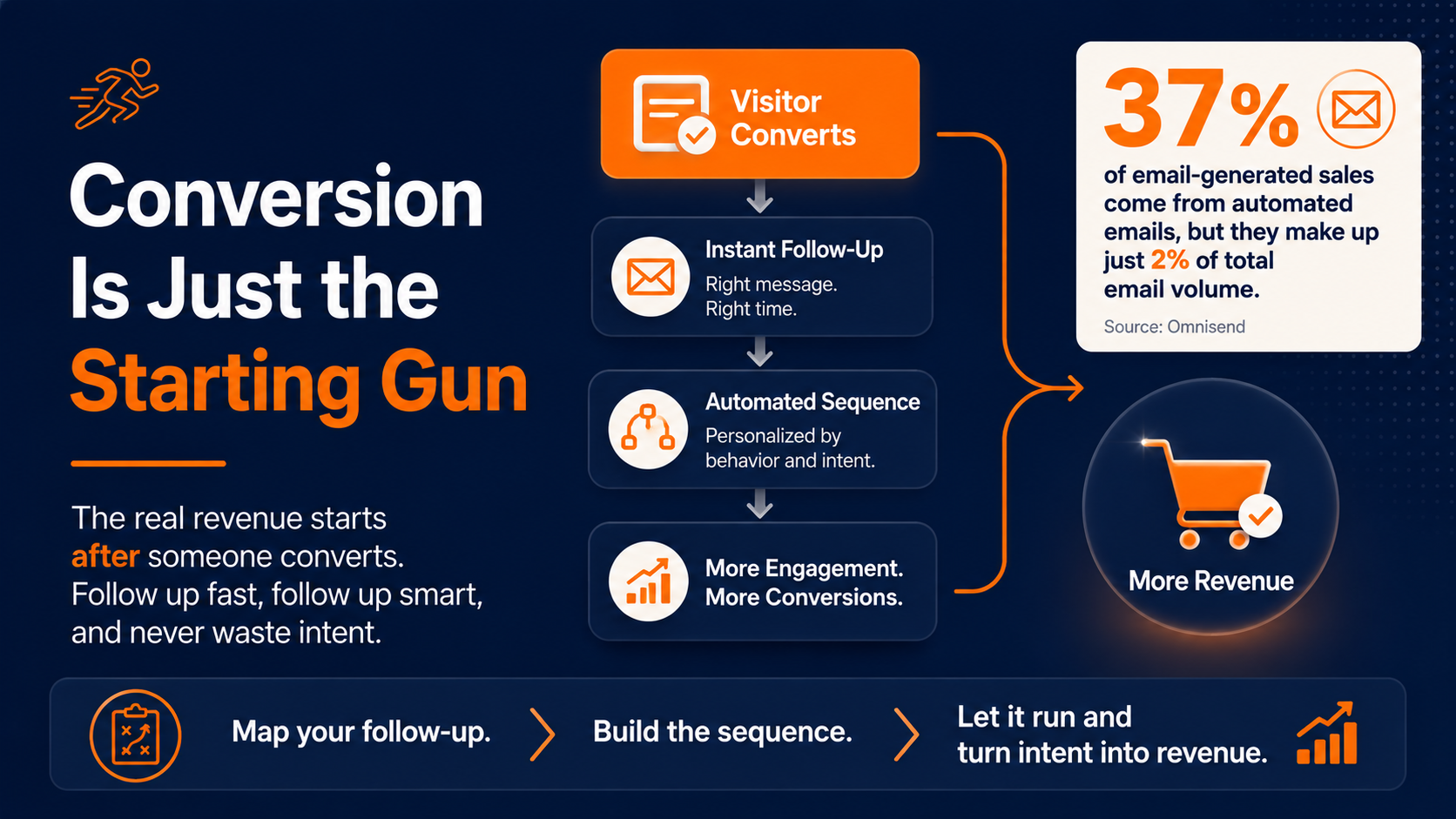
Getting the email or the form fill is the starting gun, not the finish line. The part that actually produces revenue begins right after someone converts, and that first moment is the most valuable window you'll get.
The time between when a visitor raises their hand and when you actually respond is where most of the value leaks out. A person who just subscribed is paying attention right now. Wait three days to follow up, and you're talking to someone who's already forgotten they signed up. Timing doesn't play a supporting role here. It drives most of the outcome.
The fortune is in the follow-up
Automated, behavior-triggered follow-up does a wildly disproportionate share of the work. Automated emails drive 37% of email-generated sales while making up just 2% of total email volume. That tiny sliver of triggered messages, the ones that fire because someone actually did something, carries most of the revenue.
The reason is the same one that governs everything else on this list. A message that arrives because a person just acted lands better than a message that hopes to catch them in the right mood.
You're responding to intent instead of guessing at it, and that's the difference between a page that collects contacts and one that converts them. A well-built follow-up plan treats that first message as part of the conversion, not a separate step you get to later.
Build the sequence once, let it run
The point of conversion optimization was never a single better button. What you're really building is a system where the button, the form, the follow-up, and the next message all work together without someone manually pulling levers every day.
Map the sequence before you launch it. What triggers the first email, what the visitor sees next based on how they respond, and what stops the sequence once they've converted.
Once that logic exists, it runs on its own, and every visitor who converts gets carried forward instead of dropped into a list nobody looks at until next quarter. If you want to see how that follow-up architecture comes together, this walkthrough on building automated landing page workflows breaks the sequence down step-by-step.
Where Your Website Conversion Optimization Actually Runs
Everything above comes down to one shift. Stop treating the conversion as a single moment on a single page, and start treating it as a sequence that responds to what each visitor actually does. The button and the form get someone in the door. What happens in the minutes and days after is what turns that action into revenue, and that part can't run on someone remembering to send the next email.
Start by defining the actions that matter. Someone converts on your form, opens the first email, clicks but doesn't buy, and the platform moves each person into the right next message automatically, across email and SMS, from one set of customer data. The optimized page captures the intent. The automation acts on it while it's still fresh, which is the only time it's worth much.
That means the work you put into tightening your forms, sharpening your CTAs, and speeding up your pages doesn't stop paying off at the moment of conversion. It feeds a sequence that keeps converting the audience you already earned, instead of leaking them the second they raise their hand.
Find the hidden breakdowns in your current automation setup
If you'd rather have someone look at where your current site and follow-up are leaking conversions before you rebuild anything, schedule a marketing automation audit with our team, and we'll walk through your setup together to find exactly where a tighter sequence would convert more of the traffic you're already paying for.