Landing pages need to be an essential part of your email marketing strategy, because they help to turn interested, anonymous prospects into paying customers.
Maybe you've succeeded in getting anonymous prospects to visit your site, and you've piqued their interest and convinced them to read your content, but there's still something missing.
Converting these unknown, anonymous prospects into subscribers and eventually, through successful lead nurturing campaigns, into paying customers. This is where you need well-designed landing pages.
Why the page, not the traffic, is usually the problem
Most marketers respond to a weak landing page by buying more traffic. They pour budget into ads, tune their keywords, chase a cheaper click. The page underneath stays exactly the same, so the breakdown in the funnel stays exactly the same. You are just filling a bucket with a hole in it faster.
The good news is that a landing page is one of the most fixable assets you own. It is a finite set of components, and each one does a specific job. Get those components right, and the same traffic you already have starts converting at a rate that would have required doubling your ad spend to fake.
This is a walk-through of the seven parts that make a landing page actually work, why each one earns its place, and what separates the pages that convert from the ones that just sit there looking professional.
Start With A Headline That Makes The Value Obvious
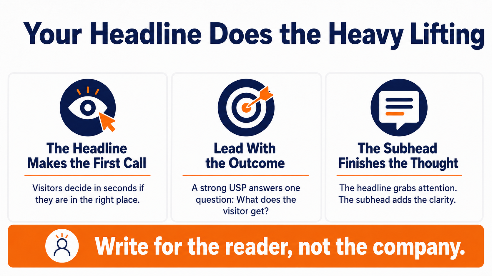
Your headline is doing more work than any other element on the page, and it gets the least attention in most planning meetings. A visitor decides within a couple of seconds whether they are in the right place. The headline is what makes that call, before anyone reads a single word below it.
Get it wrong and nothing downstream matters, because the visitor is already reaching for the back button. Get it right, and you have bought yourself the attention to make the rest of your case.
The unique selling proposition has to answer one question
The classic framing for this element is the unique selling proposition, and it still holds up. Your USP answers a single question for the visitor. What makes this worth my attention over every other option I could click back to. Not what your product does. What the person gets.
That distinction matters because most headlines describe the company instead of the reader. “The leading omni-channel platform for modern teams” tells a visitor nothing about their own life. “Send the right message to the right person without building it by hand” tells them what changes for them. One is about you. The other is about them, which is the only version they care about.
Give the headline a subhead to finish the thought
A headline cannot carry the whole promise on its own, and it shouldn't try. Pair it with a shorter subheadline that adds the clarifying detail the headline had to leave out to stay punchy. The headline grabs. The subhead explains.
Together they set an expectation the rest of the page then has to deliver on. Set that expectation clearly and everything below works more effectively. Leave it vague and even a beautifully designed page underneath will not recover the visitor you already lost at the top.
Pro Tip: Write your headline last, after you have drafted the offer and the benefits. It is far easier to distill a promise you have already spelled out than to invent one cold.
Spell Out The Benefits, Not The Feature List
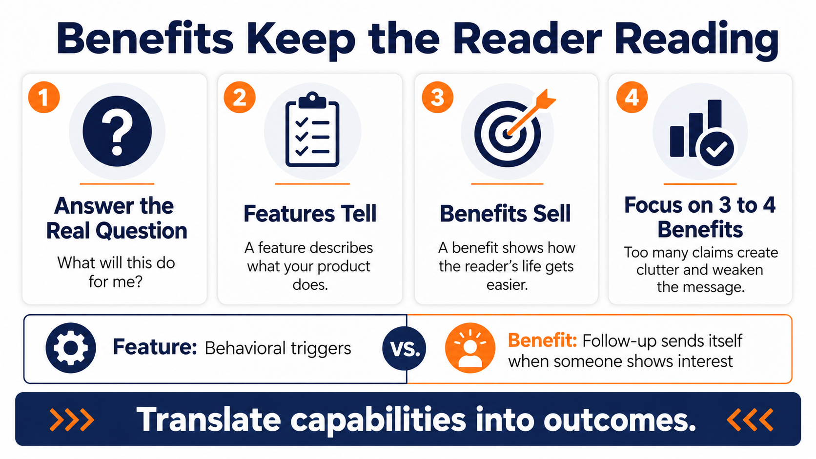
Once the headline earns a few more seconds of attention, the visitor has a follow-up question waiting. What will this actually do for me? This is where most landing pages switch from selling to bragging, and where a lot of otherwise good pages lose their visitors.
The reader is still deciding whether to stay. Answer their question directly, and they keep reading. When you talk about yourself instead, you give them a reason to leave.
Features describe the product, benefits describe the reader's life
There is a reflex to list everything your product does. Resist it. A feature is a fact about your product. A benefit is a change in the reader's situation. “Behavioral triggers” is a feature. “Your follow-up sends itself the moment someone shows interest” is the benefit that feature creates.
Visitors do not buy features. They buy the version of their day, their quarter, or their job that gets easier once the feature is doing its work. Translate every capability into the outcome it produces, and you're suddenly speaking the only language that moves anyone toward a decision.
Pick three or four benefits and stop there
More is not better here. A page that lists twelve benefits becomes a struggle to read, and the visitor cannot tell which one actually matters to them. Choose the three or four outcomes your best customers care about most and give each one room to land.
Clutter is a conversion killer for a reason. Every extra claim you add dilutes the ones that were already working. A focused page with four strong benefits will out-convert a crowded page with twelve every time, because the visitor can only hold so many things in their head and act on them.
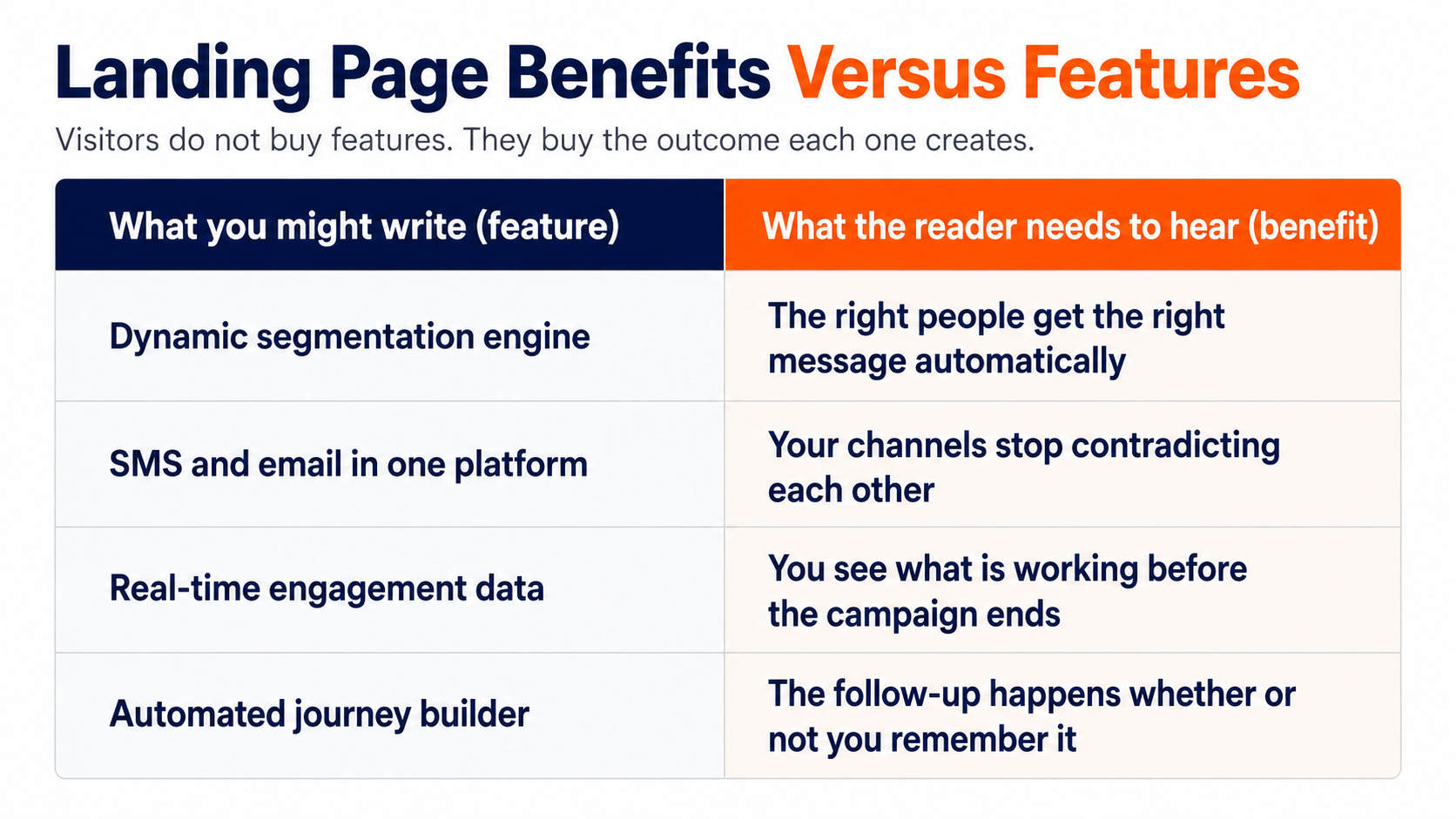
See The Benefits Versus Features Split In One View
The difference between how marketers write and how visitors read is easiest to see side by side. The left column below is the language most teams reach for by default. The right column is the same capability rewritten as the outcome for the reader.
Read the whole page in the language of the right column, and notice how different it feels. The feature tells the visitor what exists. The benefit tells them why their situation improves, which is the only thing that moves them toward the form.
Show The Offer Instead Of Only Describing It
People skim before they read, and a wall of text gives a skimmer nothing to grab onto. This is why the visual representation of your offer is a load-bearing element, not decoration. It is often the first thing the eye lands on after the headline.
A visitor who understands your offer at a glance is far more likely to stay and read the details. A visitor who has to decode a paragraph before they know what you are offering is a visitor you are about to lose.
A single strong image does the work of a paragraph
The right image communicates in an instant what a paragraph takes real effort to absorb. A product shot mid-use, a diagram of how the thing solves a problem, a clear picture of what a free trial actually gets them. Any of these lets a visitor understand your offer before they have committed to reading a word.
The key is relevance, not polish. A gorgeous stock photo of a smiling stranger in an office tells the visitor nothing. A plain screenshot showing exactly what they will get tells them everything. Choose the image that reduces confusion, not the one that wins a design award.
Match the visual to what the visitor is deciding
Different offers call for different images. A comparison graphic works when the visitor is weighing you against an alternative. A product-in-action shot works when they need to picture themselves using it. A simple visual of the reward works when the offer itself is the hook.
The question to ask is always the same. What is this person unsure about right now, and what image would resolve it? Answer that and the visual stops being filler and starts doing real persuasive work.
Pro Tip: Put your strongest visual near the top, in the same eyeful as the headline, so a skimmer understands the offer before they decide whether to scroll.
Ask For Only What You Need On The Form
The registration form is where interest turns into a lead, and it is also where a huge share of interested people give up. Your form is the currency of the exchange, and the price you set matters enormously.
Set that price too high, and people who wanted what you offered will still walk away at the last step. The form is not the place to get greedy.
Every extra field costs you conversions
There is a direct relationship between how much you ask for and how many people finish. Each additional field is another small reason to abandon the whole thing. A visitor who was happy to give you an email address balks the moment you also want a phone number, a company size, and a job title.
Decide what you truly need to follow up, and cut everything else. If the goal is to start a nurture relationship, an email address is often enough. You can always gather more later, once the person has a reason to trust you with it. Asking for everything upfront trades a completed form for a more detailed abandonment.
Placement and framing change completion rates
Your landing page design and where the form sits on the page affect how it performs. A form that appears before you have explained the value is asking for payment before showing the product. Lead with the benefit, then present the form once the visitor understands what they are getting in return.
The same logic applies to the language around the form. “Submit” describes what the button does for you. “Get my free trial” describes what the click does for them. Frame the exchange as something the visitor gains, not something they surrender, and more of them will follow through.
Pro Tip: Before adding any form field, ask whether your sales follow-up would actually fail without it. If the honest answer is no, delete the field.
Write A Call To Action That Says What Happens Next
The call to action is the moment of truth, the single click the entire page exists to earn. And it is astonishing how many pages fumble it with a button that says nothing.
Everything above the button was built to get the visitor here. A weak CTA squanders all of it at the final stage.
Generic buttons leave conversions on the table
“Click here” and “Submit” are two of the most common calls to action and two of the weakest. They describe a mechanical action, not a result. The visitor already knows they are clicking. What they want to know is what they get for it.
Instead, make the button describe the outcome. “Get your free guide,” “Start my trial,” “Send me the audit.” Each one tells the visitor exactly what is on the other side of the click, which removes the last flicker of hesitation. This is the same reason personalized CTAs convert 202% better than generic ones. When the button speaks directly to what the visitor wants, more of them press it, so the wording of that one button is worth more testing than almost anything else on the page.
Make the call to action impossible to miss
Clarity of copy only helps if the button is actually visible. A CTA that blends into the page might as well not exist. Give it a color that stands out against everything around it, enough space to breathe, and a size that signals it is the main event.
One primary action per page is the goal. Competing buttons split the visitor's attention and dilute the decision you actually want them to make. Point everything on the page toward the same single click, and make that click obvious enough that nobody has to hunt for it.
Back It Up With Proof And A Reason To Trust You
By the time a visitor reaches your form, they are weighing one question. Can I actually trust these people? The last two of the seven elements exist to answer it, and skipping them leaves the sale hanging on faith alone.
Trust is not a nice-to-have at the bottom of the page. It is often the difference between a filled form and a closed tab.
Testimonials and third-party validation outweigh your own claims
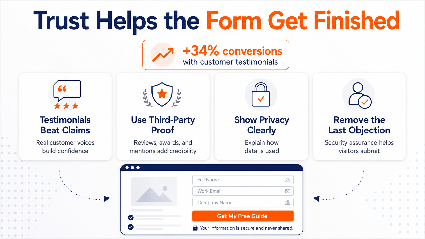
You can say your product is great all day. It means far less than one real customer saying it for you. Testimonials, review scores, analyst mentions, and awards all do something your own copy cannot. They let an outside voice vouch for you.
The effect is measurable, with customer testimonials lifting conversions by around 34%. Specific, attributed quotes with a real name and result beat vague praise by a wide margin, because a visitor can tell the difference between a genuine customer and a line your marketing team wrote.
Placement matters as much as the proof itself. Put your strongest testimonial near the call to action, right at the moment of decision, where the reassurance does the most good. Proof buried in a footer nobody scrolls to is proof wasted.
A visible privacy and security policy removes the last objection
The seventh element is the one everyone treats as an afterthought, and it protects everything above it. When you ask for someone's information, they want to know what happens to it.
A clear link to your privacy policy, a visible note about how you will use their data, a simple security assurance near the form. These feel minor, and they are not.
People have been burned before. They have handed over an email and gotten buried in spam. A short, honest statement about what you will and will not do with their information removes the last reason to hesitate. It costs you almost nothing to add, and it recovers the cautious visitors who would otherwise close the tab at the finish line.
Turn A Static Page Into A Working Journey
Every element above assumes the same thing. That a visitor arrives, converts, and then something good happens next. That last part is where most landing pages fall apart. The form gets filled out, the lead lands in a list, and then it sits there while someone means to follow up and never quite does.
A landing page does not finish its job at the point of conversion. It finishes when the person who converted gets the right next message at the right moment, and that depends entirely on what happens after the click. A great page feeding into a dead follow-up is a great page wasted.
Where the conversion hands off to the follow-up
A strong lead-management strategy relies on immediate, event-driven handoffs rather than manual follow-ups. The moment a user submits a form, your marketing automation software should instantly trigger a multi-channel welcome sequence across email and SMS tailored to their specific sign-up context.
Pairing these automated triggers with dynamic segmentation ensures newly acquired leads immediately receive messaging based on their actual behavior, eliminating manual list maintenance and preventing warm prospects from stalling in an unmonitored queue.
If you want the fundamentals behind that follow-up, our guide to building an email marketing strategy covers how to sequence those first messages so the momentum from the conversion does not die on day one. The page opens the relationship. The sequence behind it is what actually turns that lead into revenue.
Putting The Seven Elements To Work On Your Next Build
You now have the full anatomy of a high-converting landing page. A headline that makes the value obvious, benefits written in the reader's language, an offer shown rather than described, a form that asks for only what it needs, a call to action that names the outcome, proof that an outsider vouches for you, and a visible promise about how you will treat their data.
None of these is complicated on its own. The pages that convert are simply the ones where all seven are present and pulling in the same direction.
Make it a priority to pull up your highest-traffic landing pages and audit them against those seven elements, one at a time. Wherever a piece is missing or weak, that is where your conversions are leaking. Fix the biggest gap first, then work down the list.
If you would rather have another set of eyes on where those gaps are, schedule a marketing automation audit with our team, and we will walk through your page and the follow-up behind it, and show you exactly where the conversions are sitting unclaimed.