
Brand identity goes far beyond logos and conference-room pitch decks. It is a system of subconscious signals created by consistent colors, fonts, shapes, and voice that customers file away and recall when deciding whether to open your email or scroll past it.
Key Takeaways
The 6 Core Brand Identity Elements:
-
- Logo & Wordmark: The visual anchor. Ensure you have dark-mode and varied aspect ratio variations for email clients.
- Corporate Font: Silent, essential type choices. Select web-safe fallbacks so copy renders cleanly across all devices.
- Color & Imagery Style: Your primary recognition driver. Lock down 2–3 core colors and keep imagery styles unified across all sends.
- Shape & Form: Subtle visual cues (e.g., rounded vs. sharp-corner buttons/headers) that reinforce your brand's personality.
- Taglines & Brand Voice: Tonal consistency across channels. Your voice should sound identical whether in a 200-word email or a 20-word SMS.
- Supporting Visual Motifs: Repeatable graphic elements (patterns, signatures) that allow instant recognition without reading text.
The Cost of Inconsistency:
-
- Revenue Impact: Consistently presenting a brand increases revenue by 10% to 20%, yet only about a third of brands consistently enforce their brand guidelines.
- Rebuilding Recognition: Shipping off-brand sends resets subscriber familiarity, forcing you to pay twice to rebuild audience trust.
Systematize to Scale:
Stop relying on memory to maintain brand standards. Lock exact colors, fonts, layouts, and logo variations directly into reusable email/SMS templates to ensure every message ships on-brand by default.
Turn Split-Second Visual Recall Into Higher Open Rates
Most people can picture a brand's color before they can remember its name. In one experiment, participants shown five made-up logos recalled the primary color 78% of the time and the company name only 43% of the time.
It's shocking to think that the things you agonize over, like the name, the wordmark, the clever tagline, end up taking second to a color your eye caught in half a glance.
Build brand memories that win the inbox decision
Seth Godin put it plainly. A brand is the set of expectations, memories, and relationships that make someone choose you over the alternative. Notice what's missing from that definition? It didn't mention a logo or even a font. Those are just the tools you use to build the memory.
So let's talk about the elements of brand identity that build that memory, why each one matters, and how they show up in the one place most marketers underuse them. The inbox.
What Are The Elements Of A Brand Identity
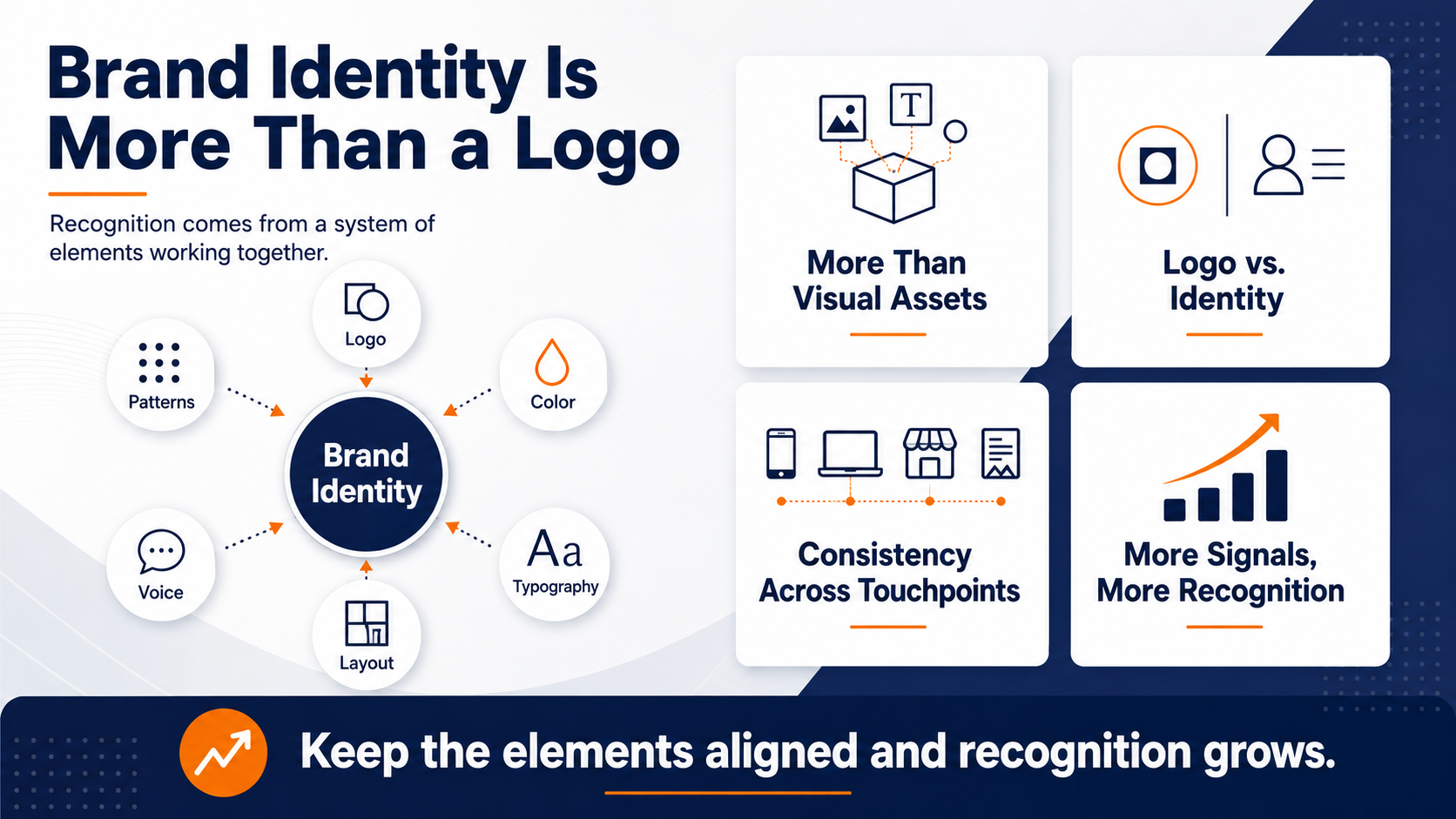
When people ask what the elements of a brand identity are, they usually expect a list of visual assets. Logo, colors, fonts, done. And while that answer isn't wrong, it's just incomplete in a way that costs you recognition.
The full set of brand identity elements works more like a system. Each piece reinforces the others, and the reinforcement is where the value lives.
A logo on its own is a shape. A logo paired with a consistent color, a recognizable typeface, and a repeated visual pattern becomes something a customer can spot from across a crowded inbox.
The difference between a logo and an identity
A logo is one identity element. An identity is every element working together, every time someone encounters you.
Think about how you actually recognize brands in the wild. You rarely read the name first. You catch the color, the shape, the layout, the tone of the writing, and your brain assembles those into “oh, that's them” before you've consciously processed a single word. That assembly only works if the pieces stay consistent from one touchpoint to the next.
Why the brand elements have to travel together
The part where most teams struggle with their brand identity is that it isn't consistent across all channels. They nail their identity on the website, then let it fall apart everywhere else. The email looks nothing like the landing page. The SMS blast uses a different voice entirely. And the customer, who was starting to recognize you, has to start over.
Consistency across every touchpoint is what turns a collection of assets into an identity people remember. When you keep the elements aligned, recognition compounds. When you don't, you're paying to rebuild it every time.
How many elements are we actually talking about
You'll see brand identity broken into anywhere from four elements to a dozen depending on who's writing the framework. This post works through six that matter most, but the number matters less than the principle behind it.
Every element you add is another signal a customer can use to recognize you, and another signal you now have to keep consistent.
That's the tradeoff worth understanding before you work through the elements of brand identity one by one. More elements mean richer recognition when they're disciplined, and more ways to look scattered when they're not.

The Six Brand Identity Elements Worth Building Around
You can slice brand identity a dozen ways, but most of the marketing identity elements that matter fall into six core categories. Get these right, and the rest tends to follow.
These are the six brand identity elements we'll walk through: your logo or wordmark, your corporate font, your style consistency across imagery and color, your shape and form, your taglines, and your other visual elements. Each one does a specific job in making you recognizable, and each one gets tested every time you hit send.
Your logo or wordmark
Your logo is the anchor. It's the single asset most people associate with your brand, and it should get the most attention.
A logo can be a graphic symbol, a wordmark (your name in a distinct typographic treatment), or a combination of both. More companies are moving toward clean wordmarks as their logo of choice.
Some great examples include brands like FedEx, CNN, and Coca-Cola. A well-set name delivers instant recognition without leaning on extra graphics. If you go the wordmark route, make sure the type is designed with intent and reflects your brand's personality.
Logo variations that survive the inbox
Testing your logos across your email marketing campaigns can help you weed out the good from bad quickly. Your logo will render against a white background in one client, a dark-mode background in another, and a preview pane that crops it in ways you didn't design for in yet another.
If you only have one logo file, one of those situations is going to embarrass you. Building your dark-background and properly-sized variations up front means your anchor element stays recognizable whether a subscriber opens on a phone at night or a desktop at noon.
Your Corporate Font Is A Brand Identity Element People Overlook
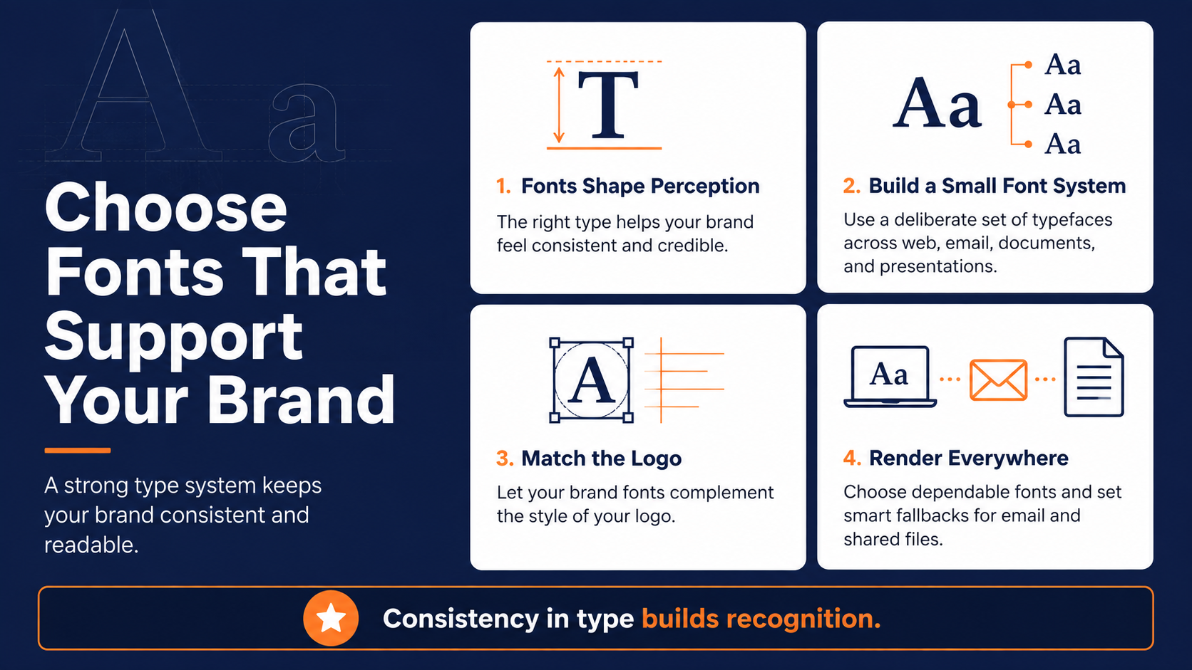
Fonts often don't get the recognition for the work they are doing in the background. Nobody emails you to say they loved your typeface, but the wrong one makes your whole brand feel off, and most people can't tell you why.
Your corporate font choice should extend naturally from your logo. Sometimes the logo's own typeface carries over. But if that type is too decorative for body copy, and many are, you'll need a complementary typeface for everything else, such as proposals, letters, email, and your website. The goal is a small, deliberate set of fonts that hold together across every format.
Fonts that actually render everywhere
Here's a practical trap. A gorgeous font that only exists on your designer's Mac is useless the moment a teammate opens the file on a PC, or a subscriber opens your email in a client that doesn't support it.
For anything shared such as PowerPoints, email templates, or documents, confirm your fonts are available across systems and degrade gracefully when they're not.
In email specifically, that means choosing web-safe fonts or defining sensible fallbacks, so your carefully chosen type doesn't collapse into something random in a subscriber's inbox.
Style Consistency Across Imagery And Color
Style consistency is where a lot of brands start to fall apart. Your images need to have a shared look and feel, not a grab bag of whatever stock photo was handy that week.
Decide on a visual style and hold it. Maybe your images are brightly lit with people looking straight at the camera. Maybe they use a muted palette with people mid-work, not posing. Crisp and detailed, soft focus, or a tight crop.
Photography, illustration, or line art. Any of those can work. What matters is that the same style shows up across every channel, online and print, so the imagery itself becomes recognizable.
Why your color palette does so much of the work
Color might be the most efficient recognition tool in your whole kit. Remember that 78% recall number from earlier? People held onto the color long after the name faded, which tells you where to spend your focus early on.
Pick two or three main colors to represent your brand, plus one or two accents. Choose them for the emotion they carry and the message you want to send.
Yellow leans toward optimism and energy. Green suggests growth or calm. Blue reads as trust, which is why so much of tech and finance swims in it. Your designer can pull shades and tints of the same core colors to widen your range without breaking recognition.
| Color | Core Brand Association | Strategic Context |
| Yellow | Optimism and energy | Invokes enthusiasm and warmth |
| Green | Growth and calm | Communicates balance, peace, or vitality |
| Blue | Trust and dependability | Heavily adopted across the tech and finance sectors |
Putting your palette to work in email
The inbox is where color discipline gets easy to lose and easy to systematize. Your header, your buttons, your links, your background, each is a chance to reinforce the same two or three colors your audience is learning to associate with you.
Lock those values down once, and every send reinforces the same signal. Leave them to whoever builds the email that week and you'll drift, one slightly-off shade at a time.
Shape And Form As Brand Identity Elements
Shape is the subtlest of the identity elements, and one of the most underused. The geometry of your brand sends a signal before anyone reads a word.
Pro Tip: Lock your two or three brand colors into every email template before you write a single subject line, so no send ever ships off-palette.
Round shapes and soft edges feel warm and approachable, and tend to create a sense of unity. Straight edges and sharp corners read as strong, efficient, and stable. Vertical lines can suggest strength, horizontal lines a calmer, more grounded feel. None of this is loud, but it's felt.
Where shape shows up in a send
You make shape decisions in every email whether you think about them or not. The rounded button versus the square one. The boxy header versus the open layout.
Match those choices to the feeling the rest of your identity sends. A warm, friendly brand with hard-cornered everything reads as off, even if the subscriber can't say why. It's subtle, but it holds the whole impression together.
Taglines And Your Marketing Identity Elements
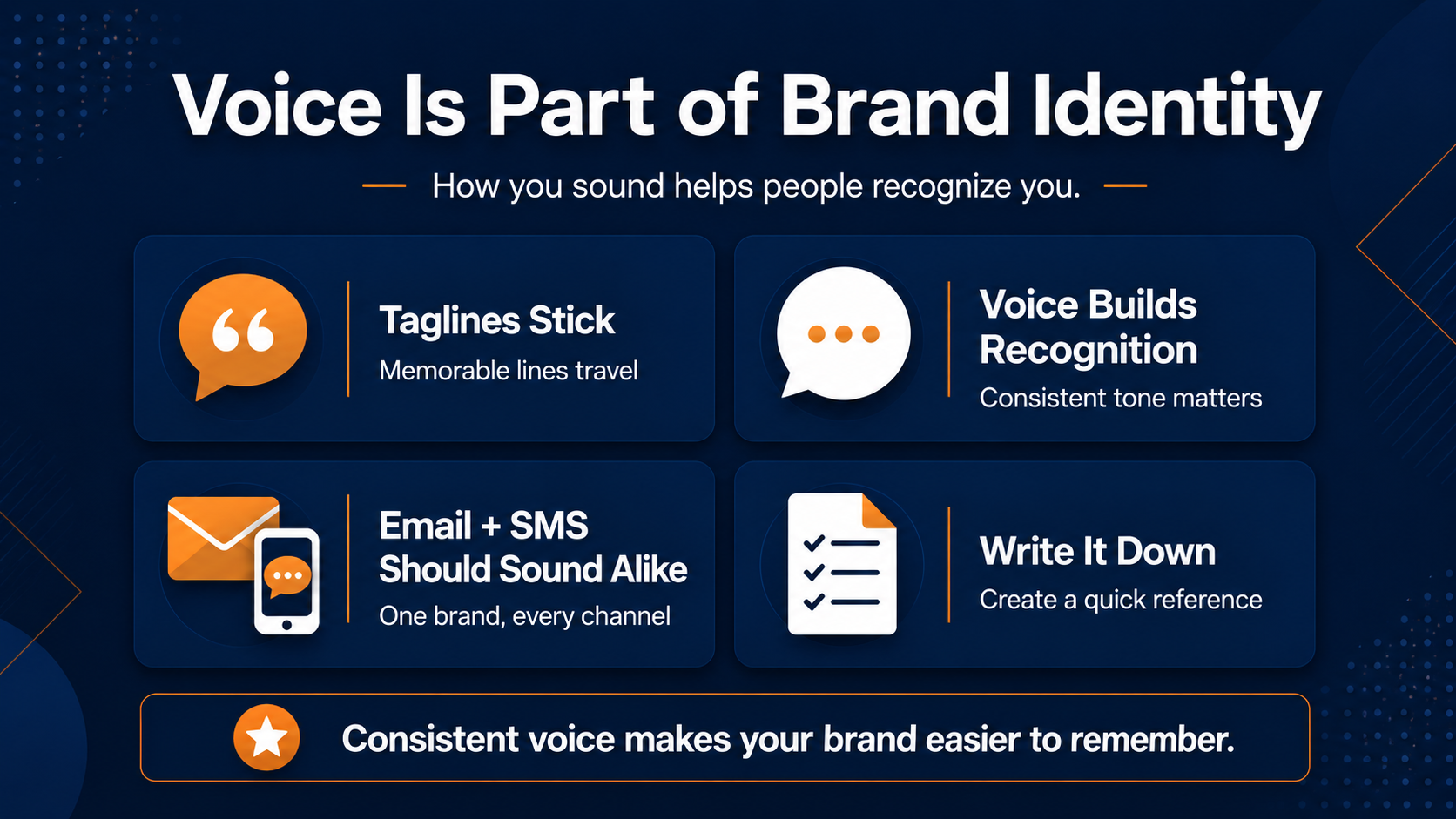
Not every identity element is visual. How you sound is just as much a part of who you are, and in email and SMS, it might be the element doing the most work.
A tagline or theme line, when it lands, becomes shorthand for the whole brand. Nike's “Just do it.” KFC's “It's finger-lickin' good.” Once a line like that sticks, people carry it around for you. It becomes part of the identity, doing recognition work every time it surfaces.
Your writing voice is an identity element too
Beyond the tagline, your everyday voice, the way your emails actually sound, is a brand identity element most teams never formalize.
If your welcome email sounds buttoned-up, but your promo sounds like a different company wrote it, your readers can tell even if it's just an off feeling they get.
Deciding how you sound, playful or precise, warm or direct, and holding that line across every message is as much a part of your identity as your color palette. A consistent voice makes a subscriber feel like they're hearing from someone they know.
Voice consistency across email and SMS
Voice gets harder to hold the moment you add a second channel. A text has a fraction of the room an email does, so the temptation to write it in whatever voice fits the character count is often the wrong choice.
The brands that get this right carry the same personality from a 200-word email into a 20-word text. The subscriber shouldn't have to wonder whether the SMS and the email came from the same company. When your voice stays intact across both, every channel reinforces the same identity instead of splitting it in two.
Write your identity down before you scale it
One reason identity drifts is that it lives in people's heads instead of on paper. The designer knows the exact blue. The founder knows the voice. Nobody wrote it down, so the moment either of them is out, the next send guesses.
A short reference doc with your brand guidelines fixes most of this. List your exact color values, your fonts and fallbacks, your logo variations, and the brand identity keywords that capture how you sound, the words you always use and the ones you never do.
It doesn't need to be a fifty-page manual. It needs to be the single place anyone building an email can check in ten seconds, so the answer is never a guess.
Other Visual Elements That Round Out Your Identity
The sixth element is the one most brands forget they have. Beyond logo, type, color, shape, and voice, a repeatable graphic motif can carry recognition on its own.
Think of Coca-Cola's ribbon, Louis Vuitton's pattern, the repeating monogram on a Coach bag. These elements let people identify a brand without a single word on the page.
You don't need one to have a strong identity, but where it fits, a distinct motif gives customers one more way to recognize you at a glance.
When a motif helps your brand and when it clutters
A supporting visual only works if it stays consistent and doesn't fight the rest of your identity. Used well, it becomes a signature. Used carelessly, it's just clutter.
The test is simple. If the motif shows up often enough and cleanly enough that a subscriber starts to associate it with you, it's earning its place. If it changes every campaign, it's just noise.
Where Brand Identity Elements Pay Off Or Fall Apart
The elements of brand identity we've covered all get tested in the same place, over and over. The moment a customer actually hears from you. And for most brands, that moment is an email or a text.
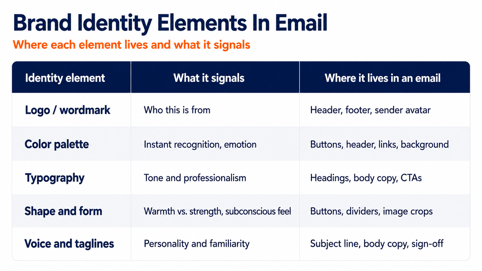
This is where identity either compounds or unravels. A subscriber who sees your color, your type, your voice, and your logo working together, email after email, builds recognition that pays you back. One who gets a different-looking message every time never gets the chance.
The consistency gap most brands struggle with
Most companies know consistency matters and yet still don't deliver it. Research from a survey of over 400 brand management experts found that consistently presenting a brand is associated with a 10 to 20% increase in revenue. That's real money left on the table by teams whose branding drifts from one send to the next.
And drift is the norm, not the exception. That same research found the majority of organizations have brand guidelines on paper, yet only around a third actually enforce them consistently.
A guideline nobody applies is just a document in a folder. The space between having standards and living them is exactly where off-brand emails ship.
What inconsistency actually costs you
The cost isn't only the revenue you don't capture. It's the recognition you keep having to rebuild. Every off-brand send resets a little of the progress your consistent sends made.
You're effectively paying twice. Once to build recognition, and again to repair it after a message that didn't look or sound like you. Discipline is cheaper than that cycle.
Why email is the highest-leverage place to get this right
Your email list is often your most direct, most frequent line to customers. Which means it's where consistency compounds fastest, and where inconsistency does the most potential damage.
Every send is a chance to reinforce the same color, the same voice, the same logo treatment your audience is starting to recognize. Miss that chance repeatedly, and you're not just sending a plain email, you're spending recognition you already paid to build.
Keep Every Send On-Brand Without Rebuilding It By Hand
The real challenge isn't deciding on your identity elements. It's applying them the same way across hundreds of emails and texts without something slipping every time a new campaign goes out.
That's a systems problem, not a design problem. The teams that stay consistent aren't more disciplined than everyone else, they've just stopped relying on discipline and started relying on the tooling.
That's where Pinpointe's reusable email and SMS templates earn their place, letting you lock your colors, fonts, logo, and layout into templates so every message ships on-brand by default instead of by memory. That same identity carries across email and SMS in one place, so a customer moving from an inbox to a text still recognizes you instantly.
When your brand identity elements are built into the platform itself, consistency stops depending on whether someone remembered the guidelines that day. It just happens.

Turn Your Identity Elements Into Recognition That Compounds
Here's what we covered and what to do with it. Brand identity is more than a logo it's a system of six elements, your wordmark, corporate font, style consistency, shape and form, tag lines, and supporting visuals, that only builds recognition when they show up consistently.
Color does more recognition work than your name. Voice is an identity element, not an afterthought. And the inbox is where all of it either compounds or quietly falls apart.
The brands people remember aren't the ones with the fanciest logos. They're the ones that show up the same way every single time, until recognition becomes automatic. Your identity elements are already decided. The real question is whether every email and text actually reflects them.
Ensure every email and text reflects your true brand identity
If your sends have been drifting off-brand, that's a fixable problem, and it's worth fixing before you spend another quarter rebuilding recognition you already earned. Request a demo and see how Pinpointe keeps every email and SMS aligned to the brand identity you worked to build.