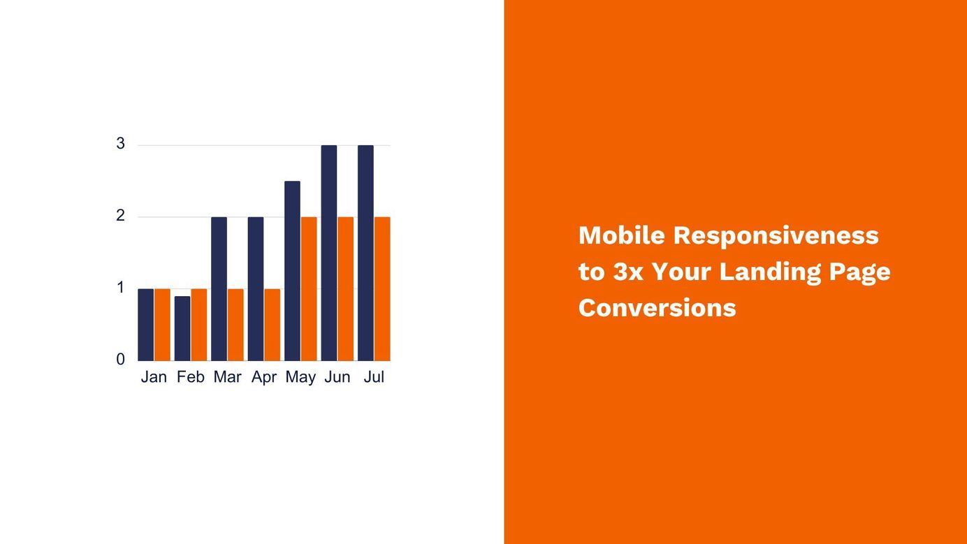
Mobile Responsiveness to 3x Your Landing Page Conversions
Table of Contents
Let's jump straight into the topic. Ever heard mobile first is the way to go?
The first and only thing you would do is test your website on the Google Chrome browser in responsive mode, followed by a mental justification that everything looks good when the website has dragged itself to the dimensions.
This approach needs to include some essential items on your checklist.
First, what's the reason to be mobile screen responsive? According to a report by Salesforce, mobile phones accounted for 79% of all global digital orders in Q1 2021, with desktop computers and tablets making up the remaining 21%. This trend is ever-growing.
To be more specific about your audience's mobile phone use, you can get insights from Google Analytics, Meta, and Google ads managers about a split of conversions on different devices.
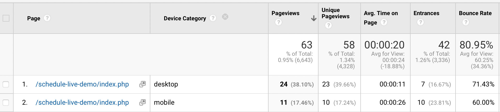
In the screenshot below, at Pinpointe, we have a lower bounce rate, more entrances, and higher time spent on mobile devices. On the desktop, the pageviews won't tell us about the overall value users give.
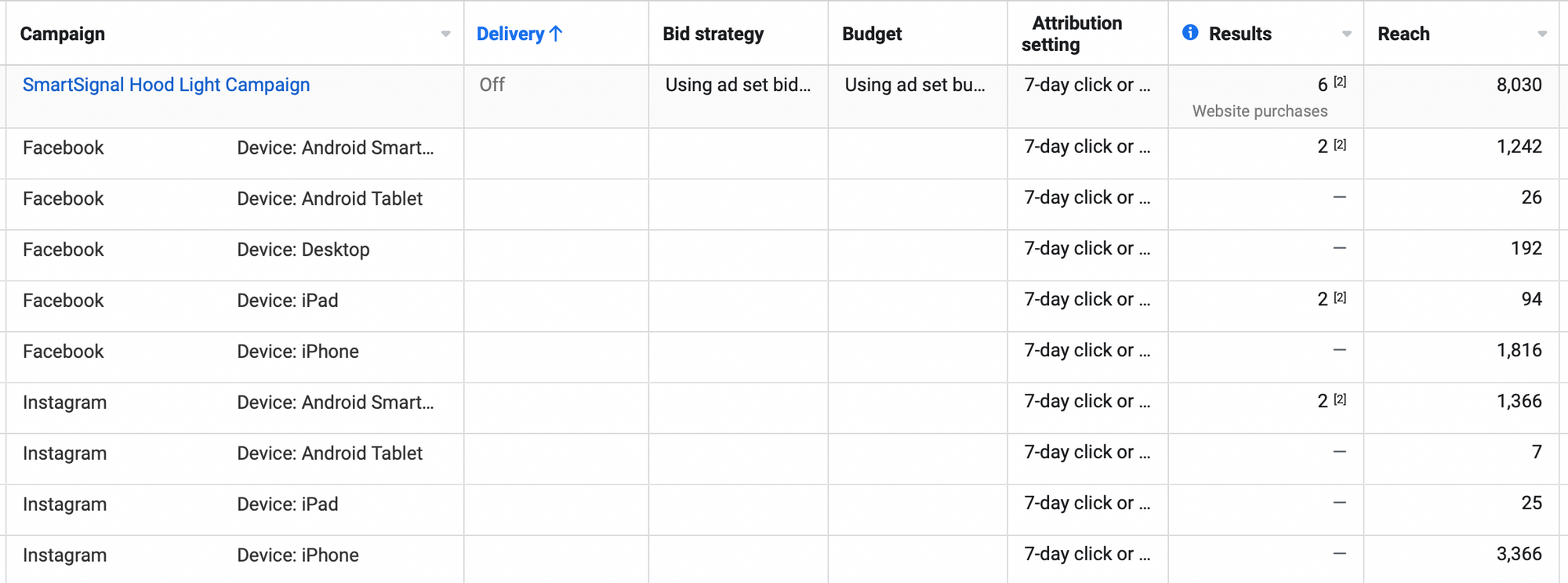
You can also view the device-level insights on Meta ads. The screenshot below refers to a dropshipping store where 100% of website purchase events occurred on a mobile phone.
It is pertinent to note that optimizing a landing page across different devices is not limited to ensuring that things 'appear normal' on mobile phones. Instead, it's also about what's important to show on a mobile screen.
Apart from what we call a customized approach to auditing your website, here is a list of items you should review in a responsive website:
- Check for Font Size: Check if the font size and spacing are optimized for smaller screens on mobile devices, making the text easy to read without zooming in.
- Check for Images and Videos: Ensure that images and videos are optimized for smaller screens and load quickly.
- Check for Navigation: Verify that the navigation menu is easily accessible on smaller screens.
- Check for Touch Screen Compatibility: Check that the website is compatible with buttons and links that are large enough to be clicked with a finger.
- Check for Content Layout: Ensure the content is well-organized and easy to navigate on smaller screens, with an appropriate layout for different screen sizes.
- Check for Load Time: Verify that the website loads quickly on all devices, as slow loading times can deter users.
- Prioritize Elements for Mobile: Some things on a desktop must be shown on mobile phones because it won't make sense there.
Pinpointe Newsletter
Join the newsletter to receive the latest updates in your inbox.

