E-commerce websites aside, businesses often use an email newsletter to share useful content with their audiences. Whether you have lists of subscribers, previous customers, or prospects, newsletters are a great tool to support audience engagement.
Even if you want to attract an audience with content only and no sales talk, that doesn’t mean that there’s no space for subtly promoting your business. In this article, we’ll show you how.
Design Your Email Newsletter For Higher Conversions
Good design is one of the fundamentals of a newsletter that gets opened and drives action. Your messaging can be well written and thorough, but if the reader can't easily take in the form of your content, they lose interest fast. This is a key reason why people unsubscribe from your email newsletter.
Design decides whether any of your writing gets a chance to work at all. Treat it as the foundation every other decision sits on top of.
Build for mobile and every email client
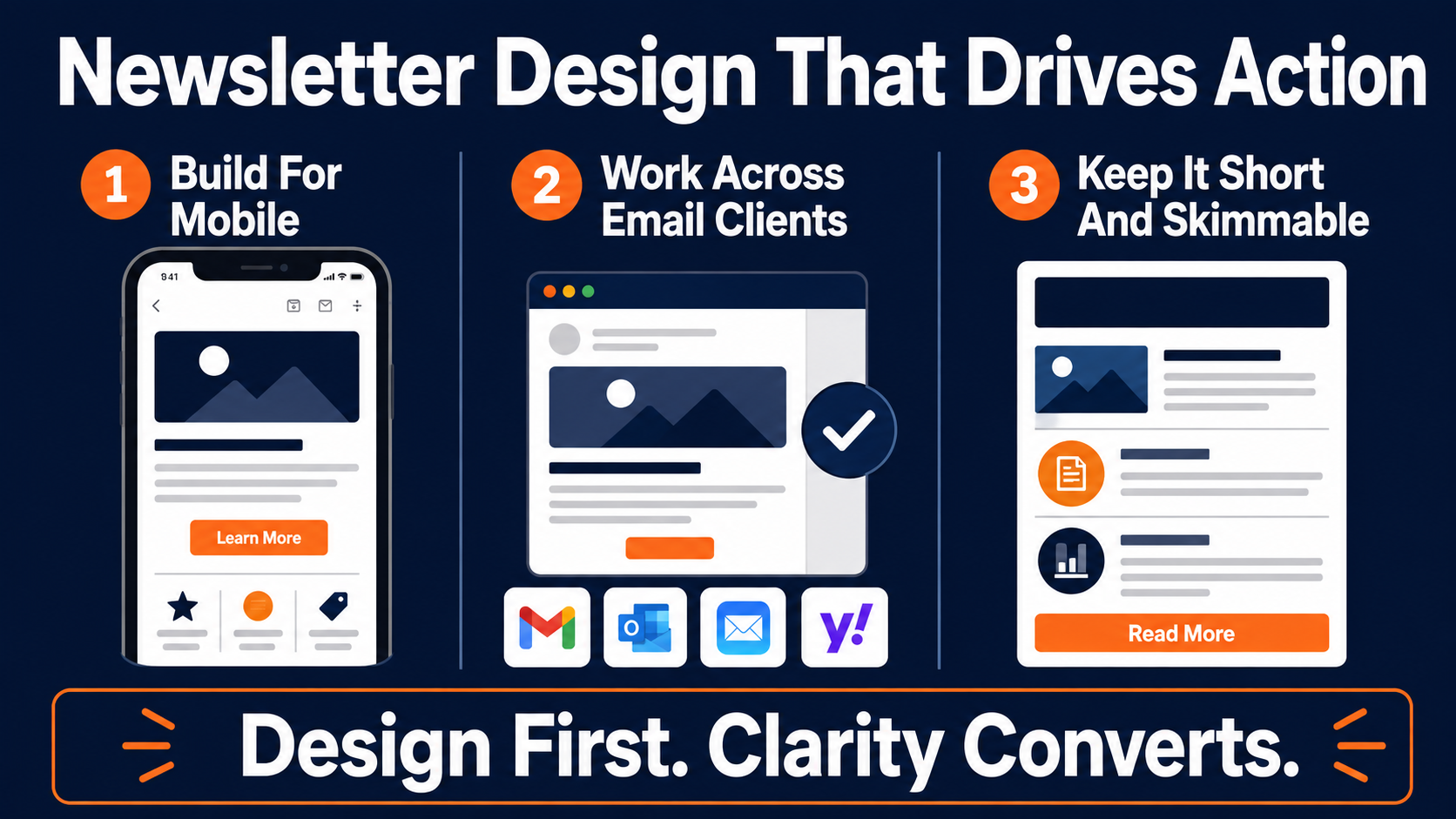
The first rule of email design is that your newsletter has to be accessible and responsive across every device, tablets and phones, while also holding up across different browsers and email clients.
That last part trips people up, because clients render code differently. There are notorious mismatches, like emails built in one tool that fall apart when they land in Outlook, so be mindful of those limits and make sure your templates are universally responsive.
Don't let desktop-first design ruin your mobile experience
More than half of all email opens now happen on a phone, which means a desktop-first design is already working against you. If your newsletter looks sharp on a monitor but collapses into a wall of tiny text on mobile, most of your audience is seeing the broken version and only a fraction is seeing the good one.
The good news is most email software now ships responsive templates that handle the heavy lifting for you. If you want to sharpen your eye for layout and rendering, it's worth keeping a few solid email design resources on hand. Whatever you use, test before you send, not after a subscriber replies to tell you the whole thing arrived as a broken column.
Keep every section short and skimmable
Another thing to remember is that you want the reader to engage further with your brand after reading, not to finish the email feeling like they already got everything. Whether your goal is a social follow, a lead, or a click-through to a full article, keep the messaging clear, concise, and pointed.
A simple constraint makes this easy. Hold each section of your newsletter to no more than 75 to 80 words. That does two things at once. It keeps you from sacrificing conversions by giving too much away inside the email, and it forces the writing to be tighter. A newsletter section should work like a trailer, teasing enough to make the click feel worth it, then sending the reader to the real destination.
Remember that almost nobody reads a newsletter word for word. They scan it in a few seconds, catch on the parts that look relevant, and decide in that moment whether anything is worth a click. Short sections, clear subheads, and a single obvious next step are what survive that kind of skimming. Dense paragraphs get skipped no matter how good the writing inside them is.
Pro Tip: If a section runs past 80 words, cut it in half and turn the second half into the reason to click through.
Make your branding unmistakable
Last on design, make sure your brand identity is clear throughout. Your logo up top, a layout that echoes your website, your brand or product name showing up naturally in the copy. The key to keeping open rates high with a static audience is building recognition and familiarity.
When someone sees your name in a crowded inbox and instantly knows who you are and what they'll get, your open rate stops living or dying by a single clever subject line.
That familiarity is what carries a newsletter month after month, and it compounds. The reader who recognizes you on send twenty is far more valuable than the one deciding whether to trust you on send one.
Share Useful Insights Your Email Subscribers Want
To build a newsletter your audience opens on sight, share insights people can actually use, and think like the customer rather than someone who knows the business inside and out. Those are different vantage points, and the newsletter has to start from the reader's.
When you develop a content strategy, begin with your customers' needs, wants, and current problems, then work backward to what you can teach. The order matters. Start from what you want to sell and the content feels like an ad. Start from what they're struggling with, and the same message reads as a favor.
Plan content around your customer's calendar
Take a car insurance company, where customers only buy once every few years. You still want to stay in touch across that stretch, so you're engaging and retaining them by the time renewal comes around.
Useful content for that audience might be guides to reducing fuel consumption, tips on saving on servicing, or how to prep a car for its inspection. None of it is an explicit sales message. All of it is relevant to the reader's real problems, and that relevance is what breeds trust while also encouraging loyalty and advocacy. By renewal time, staying with you feels like the obvious choice instead of a decision to reconsider.
That principle holds well beyond insurance. Any business with a long purchase cycle lives or dies by whether it stays useful in the quiet months. The newsletter is how you stay in the room without constantly asking for the sale.
Keep the tone light and human
It's also important to keep things light. People don't often open a brand newsletter hoping to read something heavy or negative. Customers and prospects want helpful content, relevant news, and messaging that speaks to them.
If you're a small business, this is where you have a real edge. That can mean staff updates, a day-in-the-life look at your team, or sharing and celebrating a milestone with the customers who helped you reach it. Big brands spend a fortune trying to manufacture that kind of personality. You already have it, so use it.
A little humor and a human voice also make your newsletter feel like it came from a person rather than a marketing department. That's rarer than it should be in the inbox, and readers notice it. The brand that sounds like a real human gets read. The one that sounds like a press release gets archived.
Let your customers do some of the talking
Another great way to keep things relevant, especially for e-commerce or B2C, is user-generated content. If you create space for customers to share their insights, how they use your product, uncommon uses they've found, video testimonials, or plain feedback, you build a community with a friendly face at the front of it.
Brands and products are often faceless. With the rise of influencer and social media marketing, it's clearer than ever how much weight customer recommendations and video testimonials carry.
Share testimonials, reviews, or clever alternative uses in your newsletter, and your readers get real value while your product earns credibility you can't buy outright.
There's a practical bonus here too. User-generated content is content you didn't have to write. A steady stream of customer stories, photos, and reviews keeps the newsletter fresh while lightening the load on whoever is producing it each week.
Keep Your Email Newsletter Design Consistent
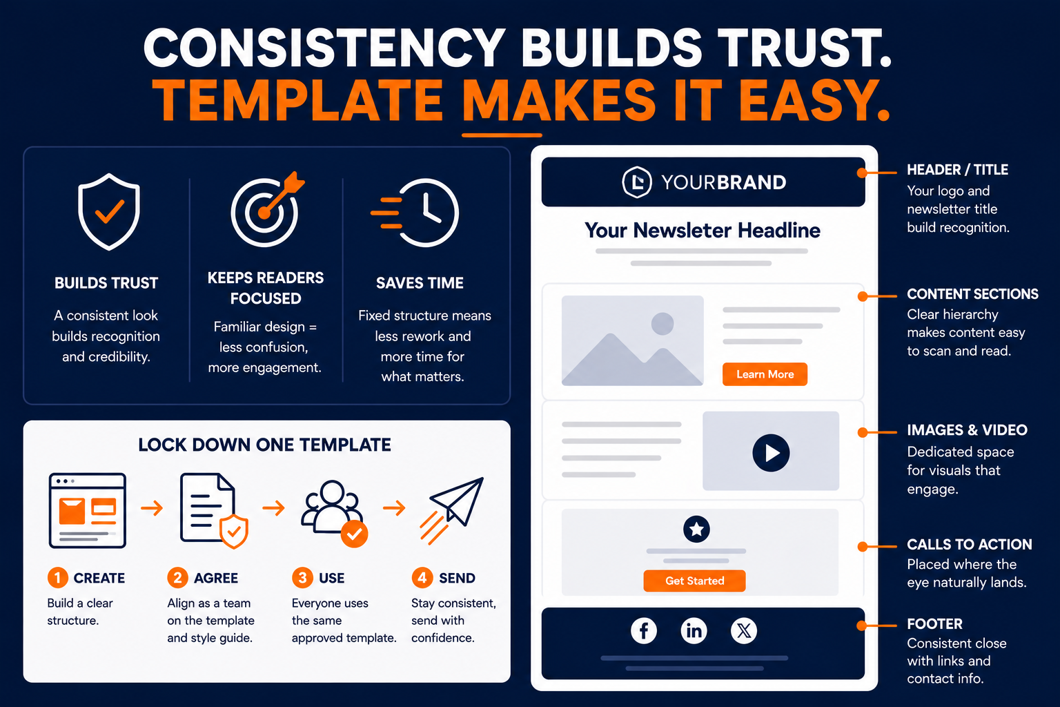
When you send newsletters and emails, your branding and styling need to stay consistent from one send to the next. Stick to a clear template, font, and style guide. Sending a different look each time is confusing, and it does nothing to build trust or credibility with your audience. Confused readers don't convert.
The fix is simple and a little boring, which is usually a sign it works. Build one template, agree internally on a style guide, and hold everyone who touches the newsletter to both.
Lock down a template everyone works from
Create an initial template and agree on it as a team. Make sure it includes a header or title, a footer, defined content sections with a clear hierarchy, room for images and video, and slots for calls to action placed where the eye naturally lands.
Your template shouldn't be something anyone rebuilds from scratch each month. When the structure is fixed, whoever is producing that send spends their energy on the content instead of reinventing the layout and drifting off-brand in the process.
Consistency also makes your newsletter faster to produce, which matters more than it sounds. A team that spends its time writing rather than reformatting can send more often, test more, and actually stick to a schedule. The template is what makes a repeatable cadence possible.
Pro Tip: Save your approved template as the default so nobody starts from a blank canvas and improvises the design.
Agree on a style guide and hold everyone to it
Your style guide covers the details that keep every send looking like it came from the same company. Heading, subheading, and paragraph font styles and sizes. Link styling. Your color scheme. It's essential that everyone contributing to the newsletter, internal or external, sticks to these rules.
It sounds fussy, but this is exactly what lets a freelancer, a new hire, and you all produce emails that feel deliberate and unified. The reader may never consciously notice the consistency, but they feel the professionalism, and that feeling is what earns the next open.
Use Clear Calls To Action In Your Email Newsletter
One of the main considerations in a high-converting newsletter is your call to action. The CTA guides the reader from your email to the action you actually want, whether that's reading your content in full, buying a product, or referring their network. It's the centerpiece of the whole thing, so it's worth obsessing over.
CTAs that convert well are usually short, two or three words, and they highlight the benefit of the action to the reader. Clear examples include Get more tips, Learn more, and Call now.
One CTA per newsletter is usually plenty. When you ask the reader to do five different things, most of them do nothing, because you've handed them a decision instead of an instruction. Pick the single most valuable action for that send and make everything point toward it.
Make the button impossible to miss
A great way to earn more click-throughs is to use a contrasting color you don't use anywhere else in the newsletter. If your email runs light blue and white, try a deep purple or a strong red for the button so it truly stands out.
Phrase it as an action, too. A button that says Call now beats simply listing your phone number in the footer, because it actively tells the reader what to do, and people are far more likely to call when they're prompted directly. If you want more on wording, it's worth studying how to write a call to action that fits each specific send.
Placement matters as much as color. A CTA buried at the very bottom only reaches the readers who made it that far. Putting your main action within the first screen, then repeating it once near the end, catches both the skimmers and the people who read all the way through.
Let A/B further improve your results
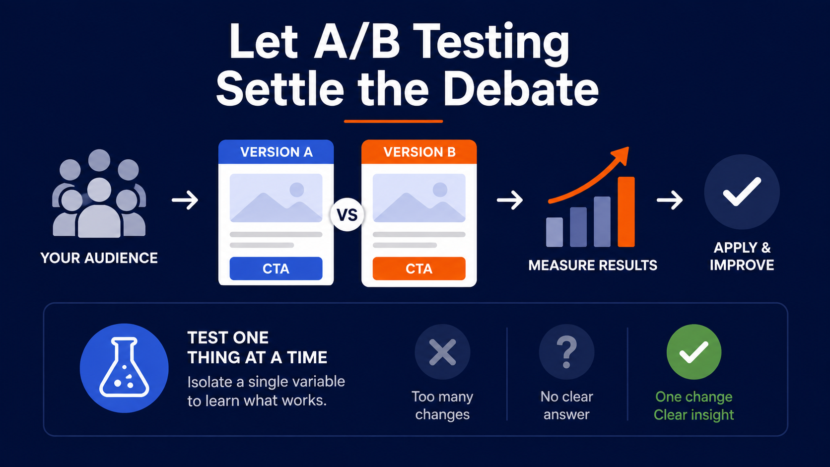
The best way to find your perfect CTA copy and button color is to A/B test. You will not guess the winner on the first try, and you don't have to.
Split your list into two or more groups. Group A gets a CTA, Group B doesn't. Or keep the copy identical and test your main brand color against a contrasting one.
There are countless ways to run it, and the bigger your audience and test size, the faster you get informed, data-led answers instead of hunches. Every send becomes a small experiment that makes the next one sharper.
The discipline that matters most is testing one thing at a time. Change the button color and the headline and the send time all at once, and a lift tells you nothing about what actually worked. Isolate a single variable, let it run, and bank the learning before moving to the next test.
Use Email Segmentation To Personalize Every Send
Using segments in email marketing sounds complicated, but with the right dataset and tools it's surprisingly simple. And it's the highest-impact change most newsletters can make.
The payoff isn't small. Marketers have reported a 760% increase in revenue from segmented campaigns. That number is enormous, and it points at the same thing we've watched play out across lists for years. Relevance is what converts, and relevance is impossible when everyone gets the identical email.
Start with the segments you already have
You don't need a data science team to begin. Group your audience into previous customers and prospects, people who refer friends and people who don't, subscribers who've left a review and those who haven't. There are plenty of practical email segmentation strategies to borrow from once you get moving.
Whether or not you're actively selling, updating your messaging by segment is what makes a newsletter feel written for one person instead of blasted at a list. Match the content to the behavior, and the copy starts landing.
Even two or three segments beat a single mass send by a wide margin. You don't have to build fifty micro-audiences on day one. Splitting engaged readers from quiet ones, or buyers from prospects, is enough to start seeing the difference in your numbers.
Match the message to what they've already done
Picture sending your entire list an email pushing Product B, which complements Product A, whether or not anyone actually owns Product A. It's noise for most of them, and noise erodes trust.
Now flip it. Someone bought a BBQ from you, so at some point they'll need charcoal, tongs, and a heat-resistant glove. A recommendation built on their real purchase history reads as helpful rather than pushy.
It's a clean way to upsell while actually serving the customer's needs. Dollar Shave Club runs this well, selling razors and then upselling shave butter, styling products, and post-shave balm to people who've already bought in.
The best part is that behavior-based sends tend to write themselves. Once you know what someone bought or clicked, the next relevant message is usually obvious. The hard part isn't the copywriting, it's knowing enough about the reader to pick the right message in the first place.
Remember the person behind the data
Last of all, remember your audience. You can also segment by demographics or geography, things like age, gender, or location. Think about how you'd shift your messaging per group so the newsletter feels relevant to each reader rather than generically addressed.
Personalization is common for most companies these days, and the brands that treat it as core strategy pull ahead of the ones still sending one email to everyone. If you want a fuller playbook, these email personalization techniques go well past first-name merge tags into the kind of data that actually moves revenue.
Make Your Email Newsletter Interactive
As customer expectations rise, one of the newer moves in newsletters is interactive content. If you want a simple edge over competitors, interactivity really lifts a brand's image, and it's more accessible than most people assume.
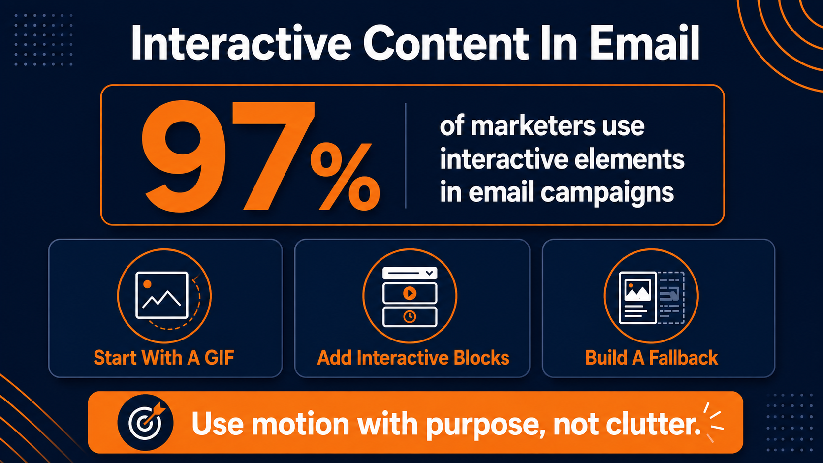
An overwhelming 97% of marketers now build some interactive element into their campaigns, so this has shifted from novelty to expectation.
You don't need to stuff the email full of heavy, data-hungry animation to get the benefit. A little goes a long way, and restraint usually beats spectacle in the inbox.
Start with something as simple as a GIF
One of the most common examples of interactivity is the humble GIF. A single GIF in the header or one image block can noticeably lift engagement and pull the reader further down the page.
It can be subtle. A little movement in your logo, or a hand setting your product down on a table. The choice is yours. The trick is restraint, because one well-placed animated moment does more than a screen full of them, and it keeps your file size sane so deliverability doesn't take a hit.
Watch the file weight, though. A heavy, oversized GIF slows the load and can drag your email toward the spam folder, which defeats the whole point. Compress it, keep it short, and make sure it still reads clearly if it happens to load as a static image.
Add interactive blocks where it fits
Beyond GIFs, accordions, short videos, and countdowns all bring a static newsletter to life. An accordion lets a curious reader expand a section without cluttering the layout for everyone else. A countdown adds real urgency to a time-boxed offer.
By adding an element of animation or movement, you help bring an otherwise static newsletter to life. Just use these where they serve the content rather than as decoration. Motion applied with intent is what separates an email people tolerate from one they look forward to.
Designing for incompatible email clients
One caution worth keeping in mind. Not every email client supports every interactive element, so always build a sensible fallback. The reader whose client strips your accordion should still see clean, readable content underneath, never a broken block where the clever part used to be.
A Quick Reference For Email Newsletter Segmentation
Segmentation only works when you can see, at a glance, what each group is telling you and what they should hear back. The table below maps four of the most common segments to the signal behind them and the kind of message that fits. Use it as a starting grid, then adapt the sends to your own list and offers.
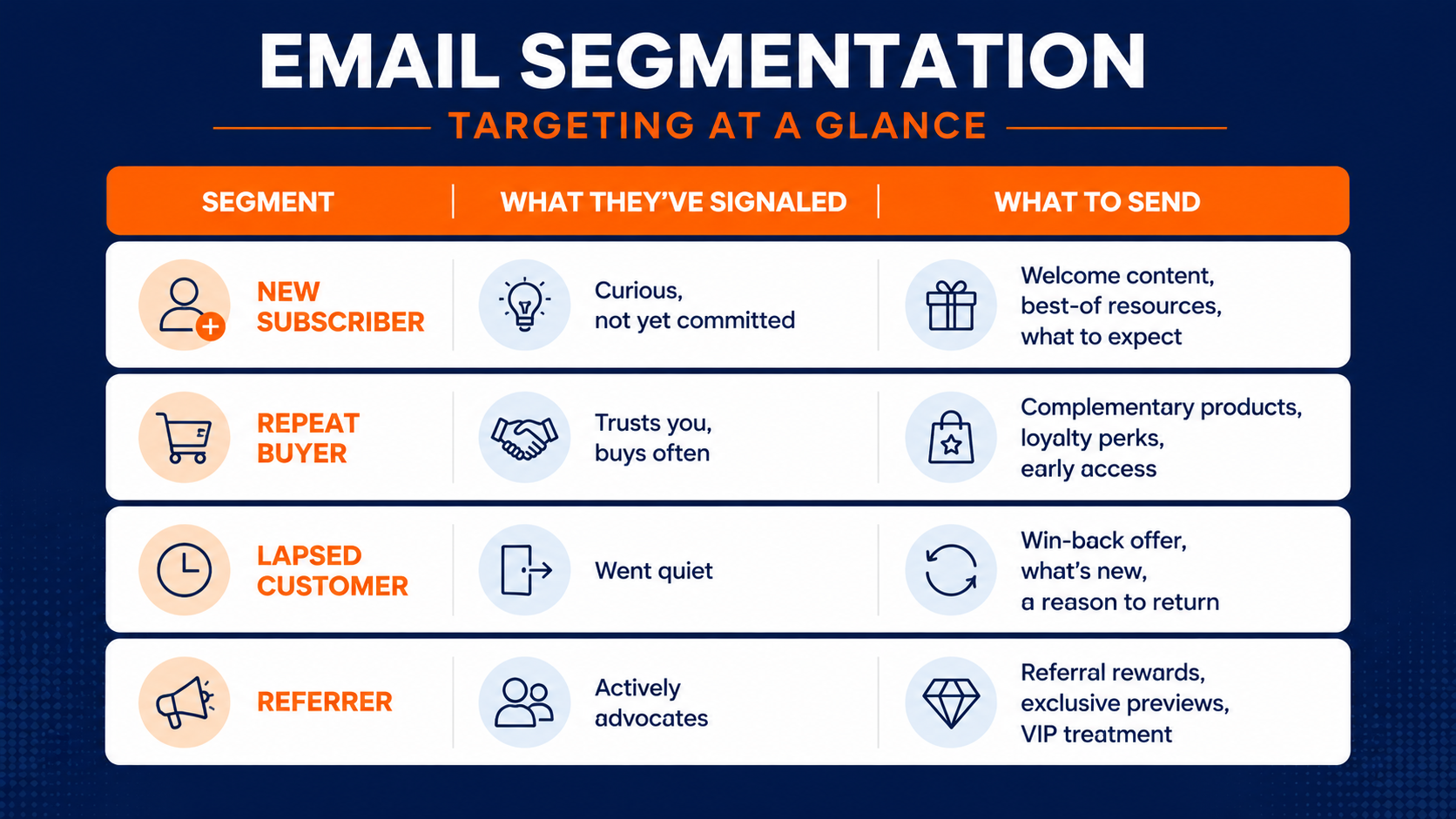
None of these four are exotic. Every list has new subscribers, repeat buyers, people who've gone quiet, and a handful of genuine advocates. The moment you start speaking to each of them differently, even a little, your newsletter stops feeling like a broadcast and starts feeling like it was meant for the person reading it.
Where To Take Your Email Newsletter Strategy Next
You've got the full picture now. Design for the thumb and every email client. Write for your customer's calendar instead of your own. Keep the branding consistent, make the CTA impossible to ignore, and let A/B testing settle your debates.
Then use segmentation and a little interactivity to turn a broadcast into something that feels personal. That's the line between a newsletter that gets skimmed and one that drives revenue every time it goes out.
Turn real-time subscriber behavior into higher newsletter revenue
The single biggest lever in that list is relevance, and relevance depends on acting on real behavior fast enough to matter. If your current setup can't keep up with what your subscribers are actually doing, that's what to fix first.
Schedule a marketing automation audit, and we'll walk through where your newsletter is losing conversions and what a connected, behavior-driven program would look like for your specific list.