Email Accessibility Matters – Are Your Campaigns Designed For It?
Table of Contents
“Before you judge someone, walk a mile in their shoes.”
This common saying emphasizes the importance of trying to understand other people’s experiences because they may be very different from your own. Let’s go on a short journey of “walking in someone else’s shoes,” to see what has inspired marketers around the world to innovate and embrace email accessibility for all subscribers.
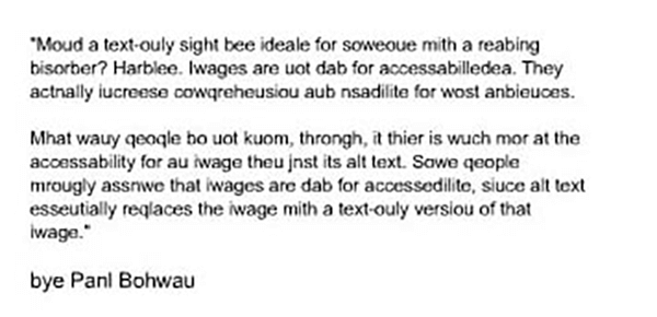
Join me in reading this below:

From the two images below, which looks more visually appealing?

Are you wondering what these two examples above have to do with marketing and email accessibility?
What you just experienced are two instances of what almost one-billion of the world’s population (per World Health Organization) go through in their daily life due to some form of a disability – from vision and hearing impairments to cognitive and learning disabilities. These ‘specially-abled’ people tend to utilize adaptive tools and technologies, including screen readers, to view website or emails in the same way other people do.
As a marketer, you must be very critical of the emails you send to your subscribers – including the theme, design, render-ability, compatibility, etc. Yet, many marketers do not think about accessibility for the visually impaired.
Three prime factors that define email accessibility include:
Email Copy & Fonts:
Use structured paragraphs of three sentences, which use proper punctuation; this helps people using screen readers. Also avoid decorative fonts and use line spacing of 1.5x the font size, so that the email copy can be easily scanned.
Images:
Use relevant images that support the email copy. You also must use appropriate alt-tags, since a screen reader can only identify an image by its alt-tag. Avoid the use of flashy GIFs since that can trigger epileptic reactions.
Call-to-Action Buttons:
CTA buttons must be a minimum height of 44px, since people with impairments might find it difficult to click the CTA button, especially when viewed on a mobile device.
To know more about creating accessible emails and reaching out to ALL of your subscribers, including tools on testing for accessibility, check out EmailMonks infographic below on “How to Make Emails Accessible: Best Practices and Tools.”
 Source: How to Make Emails Accessible: Best Practices and Tools
Pinpointe Newsletter
Join the newsletter to receive the latest updates in your inbox.


